Designing the first screen of a product detail page: what shoppers need in the first three seconds
When shoppers scroll from main images into the detail page, the first screen decides whether they keep reading or go back. Too many first screens are brand posters with almost no information. Here are three structures, information hierarchy, mobile sizing and how the first screen should differ from main images.
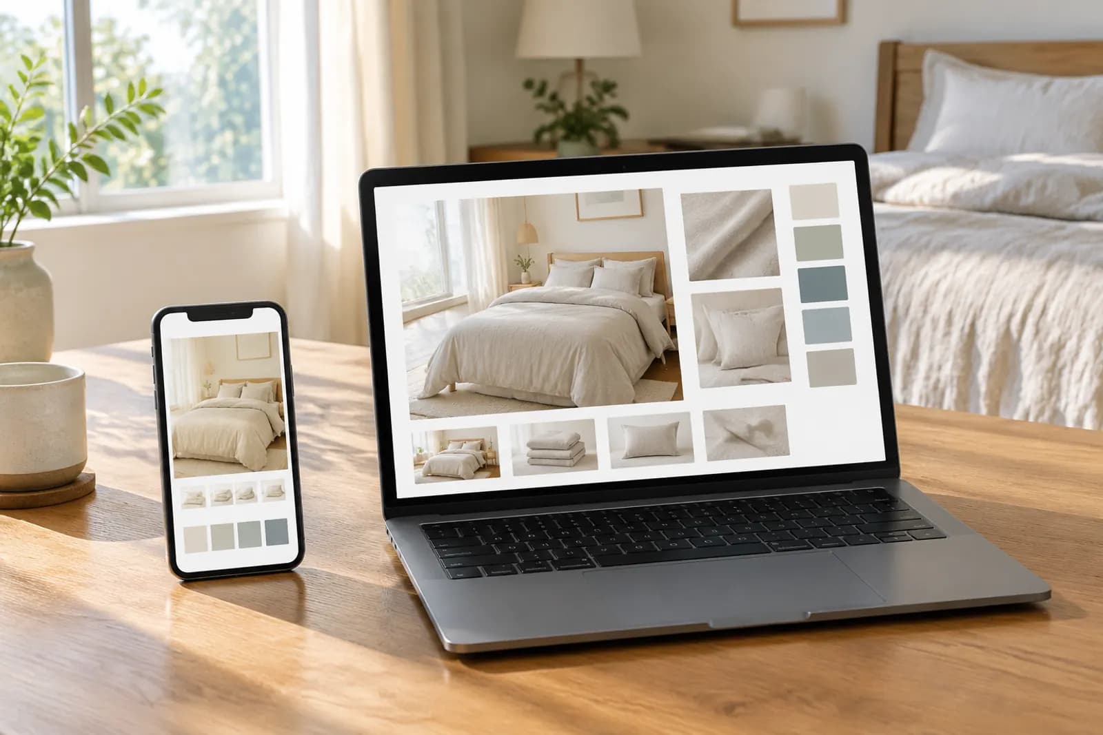
After swiping through a few main images, interested shoppers scroll down into the detail page. Whatever appears first on screen has one crucial job: make them want to keep reading.
Many shops open the detail page with a big poster: logo, slogan, mood image. Beautifully designed, but shoppers finish it without knowing what's good about the product, and go back to look at someone else's.
What the first screen is for
In about three seconds, the first screen should answer one question in the shopper's mind: "Is this worth my time to scroll?"
That usually means including:
- What the product is (simplified if main images already made it clear);
- The one to three most important benefits;
- A reason to relate — what problem it solves, who it's for.
Three common structures
1. Benefit overview
A product image plus three key benefits. Suits products with clear functions: small appliances, accessories, household goods.
- Product takes about half the frame;
- Three benefits with short headlines and icons;
- Ordered by importance.
2. Problem and solution
A familiar problem first, then the product solving it. Suits problem-solving products: storage, cleaning, care.
- Top half: the problem (a cluttered desk, say);
- Bottom half: the result;
- One line explaining how the product does it.
3. Campaign information
During major sales, the first screen can lead with the offer — discount, dates, gifts — followed immediately by core benefits. Use it only during the campaign and switch back promptly afterwards.
| Structure | Suits | Watch out |
|---|---|---|
| Benefit overview | Products with clear functions | Three benefits at most |
| Problem and solution | Problem-solving products | Realistic problems, no exaggeration |
| Campaign | Major sales | Switch back on time; accurate prices |
Hierarchy: what's seen first
Without clear hierarchy everything shouts, and nothing gets heard:
- Level one — the single most important line or benefit, largest type;
- Level two — supporting benefits or explanation, smaller;
- Level three — details like specs or certifications, smallest but still readable on a phone.
A simple test: shrink the first screen to phone size and squint. What do you see first? If it isn't what you most want shoppers to know, adjust the hierarchy.
Mobile height
Almost everyone browses detail pages on phones, and one phone screen covers a limited image height. If the first image is very tall, shoppers see only the top part until they scroll.
- Put the most important information in the top half;
- Don't make the first image too tall; split it into two if needed;
- Preview at phone proportions, not as a full image on a monitor.
Splitting work with main images
Main images and the first screen both explain why the product is good, so they easily repeat each other. A better split:
- Main images earn the click and give a first understanding; images two to four already cover core benefits;
- The first screen goes deeper — an overview of benefits or a fuller scene story.
If main images already gave each of three benefits its own image, the first screen doesn't need three big benefit images again; recap them as an overview and lead shoppers on. For splitting main images, see Taobao's five main images.
Common mistakes
- Brand image, no product information — brand posters belong further down or on the store homepage;
- Too many benefits — seven or eight on the first screen, none remembered;
- Text too small — fine on a monitor, illegible on a phone;
- Expired campaign info — the sale ended, the first screen still shows the sale price;
- Style clash with main images — fresh and clean main images, then a loud promotional first screen.
Checklist
- Core value clear within three seconds;
- Three benefits at most;
- Clear hierarchy, most important information largest;
- Text readable on a phone;
- Key information in the top half;
- Consistent with main images without repeating them;
- Accurate campaign information, replaced when the sale ends.
Working faster
The "Tmall detail first screen" template in the template library drafts a first screen from your product images and benefits; for writing benefits, see writing selling-point images. Check drafts against the list above, especially readability on mobile.
Upload one product photo and get a full set of listing-ready visuals in minutes.
Keep reading