Writing selling-point images: one benefit per image, short words, consistent icons, true numbers
Selling-point images are the most common images in a main image set and detail page, and the easiest to turn into a wall of text. Here's how to choose benefits, write headlines and support lines, use icons, and stay within limits on numbers, comparisons and claims.
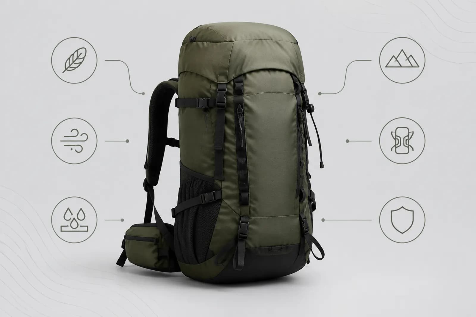
Open almost any product page and you'll find selling-point images: a product shot surrounded by three to five icons and a few lines of text. Done well, they tell shoppers in seconds why the product is good. Done badly, they're a wall of text nobody reads.
Having looked at a great many of them, the common problems fall into three groups: too many benefits, too many words, and vague claims. This article tackles each.
Step 1: choose three from ten
Product teams usually hand over long lists: quality materials, fine craftsmanship, large capacity, lightweight, waterproof, good-looking, several colours, free accessories, after-sales support. Put them all in one image and each gets a sliver of space. Nobody remembers any of them.
Three questions narrow it down:
- What do shoppers ask about most? Check customer service logs and frequent review themes.
- Which benefit do competitors lack or explain poorly? Differentiators deserve more space than generic benefits.
- Which benefit can be shown? Benefits you can photograph persuade more than benefits you can only state.
Usually three survive: one main benefit for image two of the main set, and two more later or on the detail page.
Step 2: short headline, shorter support
Text on a selling-point image has two layers:
| Layer | Length | Content |
|---|---|---|
| Headline | A few words | The result the buyer gets |
| Support line | One line | The fact behind that result |
Compare:
- "Made of premium 304 stainless steel" → headline "Won't rust", support "304 stainless steel inner" (use the real material);
- "Extra-large capacity design" → headline "A week of rice in one go", support "X litres" (measured);
- "Ergonomic design" → headline "Comfortable for longer", support "Handle curve fits the palm".
The headline states the result, the support line states the fact. The result draws shoppers in; the fact convinces them.
Step 3: prove it with the picture, not just an icon
A common layout is a white-background product with small icons around it. Icons hint; they don't prove. Better to let the image prove the benefit:
- Waterproof: the product under running water;
- Lightweight: lifted easily with one hand;
- Large capacity: shown full;
- Heat-resistant: next to a hot pan or in hot water (safely and truthfully).
When an image covers one benefit, picture and words work closely together. If you need several benefits in one image (a benefits overview on the detail page), icons are fine — but keep it to four at most.

Icons: consistency matters more than beauty
If you use icons:
- One style — all line icons or all solid icons, with matching stroke weight;
- Clear meaning — a water drop for waterproof is universal; an abstract shape needs explaining;
- Same size — icons and their spacing to text consistent throughout;
- Restrained colour — take icon colours from your brand's primary or accent palette, not a different colour per icon.
Numbers: true, specific, checkable
Numbers persuade more than anything else on a selling-point image, and cause the most trouble:
- Every number needs a basis — battery life, capacity, weight, size, from testing or reports;
- State test conditions — e.g. battery life measured under specific conditions, with details on the detail page;
- Match product attributes — the same figures in the image, attributes, detail page and customer service answers;
- Avoid vague big claims — "about X hours" beats "ultra-long battery", but if you don't have an accurate figure, leave it out.
Comparisons and claims: where lines get crossed
Comparisons and effect claims need the most care (follow advertising law and platform rules):
- No absolute terms — best, number one, ultimate;
- No disparaging others — "10× better than ordinary products" is unprovable and disparaging; compare with your own previous model or other versions, never another brand;
- Effect claims need evidence — especially for beauty, personal care, food and baby products, which have specific rules;
- No unverifiable statistics — "99% satisfaction" or "sales leader" need reliable sources.
Checklist
- One main benefit per image;
- Short headline stating a result;
- Support line stating a checkable fact;
- The picture proves the benefit, not just shows the product;
- Icons consistent in style, size and colour;
- Every number has a basis and matches attributes;
- No absolute terms, disparaging comparisons or unsupported claims;
- Text readable on a phone.
Working faster
The "selling points" plan in Product image sets can batch-draft these images, and it never invents specs you didn't provide. Check drafts against the list above and adjust details with Inpaint where needed. For where selling-point images belong in a main set, see Taobao's five main images.
Upload one product photo and get a full set of listing-ready visuals in minutes.
Keep reading