Xiaohongshu note covers: in a two-column feed, the ones that don't look like ads win
On Xiaohongshu, notes compete in a two-column feed and the cover all but decides the click. The most common brand mistake is a cover that looks like an ad. Here's how to approach 3:4 composition, text, authenticity and covers for creator collaborations.
When Xiaohongshu users open the app, they see a two-column feed: four to six notes per screen, each a cover image plus a title line. Thumbs move fast, and a cover usually gets less than a second.
Many brands start by using marketplace main images or ad posters as covers: product on white, big benefit text, a promotion. In the feed those covers are very recognisable — so recognisable that users know instantly it's an ad, and scroll on.
People come to Xiaohongshu for real-life sharing. The more a cover looks like a moment someone actually lived, the more likely it gets opened.
Format: 3:4 first
Xiaohongshu supports several ratios, but in the two-column feed 3:4 portrait takes the most space and displays best. A common size is 1080 × 1440 pixels.
- Use 3:4 for the cover and keep other images in the note consistent so swiping doesn't jump;
- Keep key content central; card corners may be rounded;
- The title sits below the card, but don't put crucial information at the very bottom of the cover either.
Composition: one image, one idea
Good covers usually have a single clear focal point. Common approaches:
| Type | What it shows | Suits |
|---|---|---|
| Atmosphere | A corner of a living space, product blended in | Home, fragrance, tableware |
| Hand-held close-up | A hand holding the product, soft background | Beauty, small items, food |
| Comparison | Before/after, or two looks | Cleaning, storage, outfits |
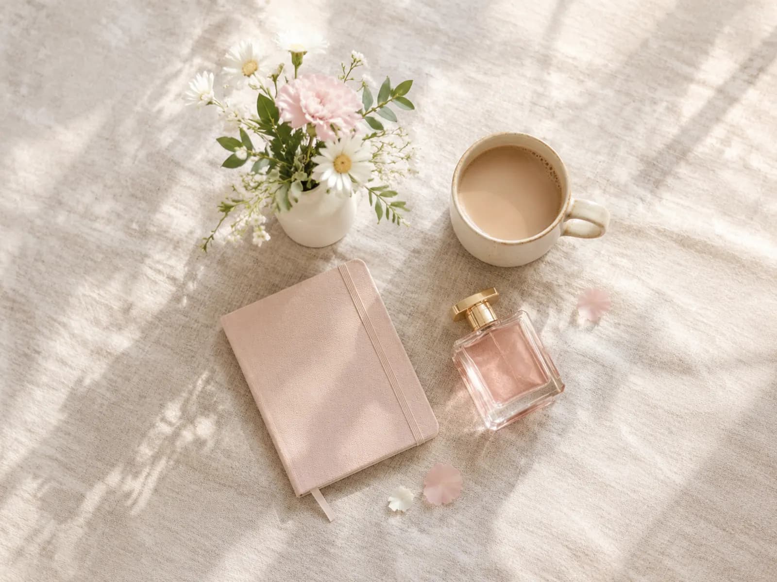
| Flat lay | A top-down arrangement | Roundups, unboxings |
| Person | Wearing or using the product | Apparel, accessories |
Whichever you choose, don't crowd the frame. Xiaohongshu users favour clean images with room to breathe.
Cover text: little, but precise
Text on covers is common, and a good line lifts taps noticeably. Keep in mind:
- Length: usually under about ten Chinese characters, two lines at most;
- Content: the result or problem people care about, not the product name — "5 low-effort storage fixes for small flats" beats "XX storage box";
- Placement: top or middle, never over the product;
- Font: handwritten or rounded styles fit the platform better than hard ad typefaces;
- Colour: contrast with the image, with a translucent band behind if needed.
Cover text is still advertising content: no absolute claims, no unprovable effects.
Where authenticity comes from
Brands often ask why their professionally shot product images feel flat on Xiaohongshu. Authenticity usually comes from details:
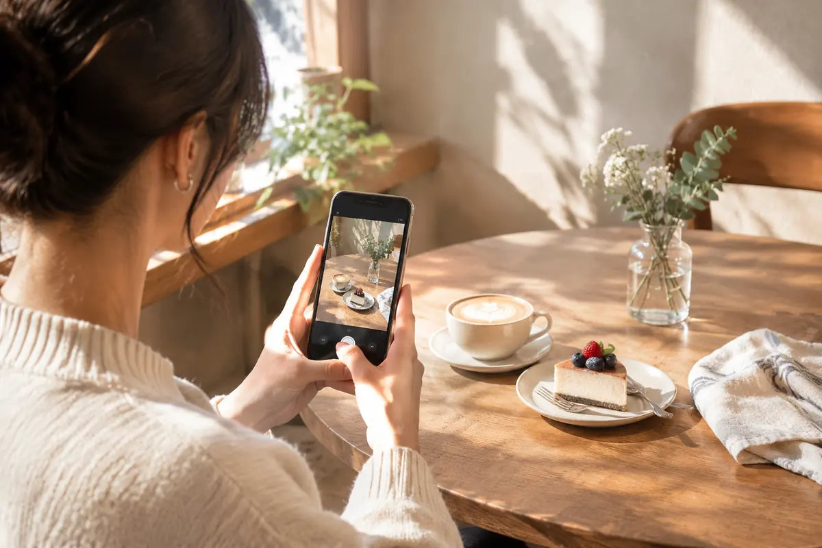
- Light — window light and warm afternoon sun rather than even studio lighting;
- Setting — a real desk, bedside or kitchen with a trace of life: an open book, a half-finished coffee;
- Viewpoint — angles people shoot on phones (top-down, eye level, hand-held), not a long-lens commercial view;
- Product state — opened, used, in use, rather than sealed and new;
- A human touch — a hand, someone seen from behind.
Authentic doesn't mean sloppy. Images still need to be sharp and composed; the style just shifts from advertising to everyday record.
Brand accounts vs creator collaborations
Brands typically run two tracks: their own account and creator collaborations. Covers differ:
- Brand account: a consistent visual style (fixed tones, a fixed cover text style) makes the profile instantly recognisable. Content leans toward tips, tutorials and launches.
- Creator notes: covers should be in the creator's own style. Brands can supply product images and a direction, but forcing a branded cover template strips away what makes creator content credible.
Paid collaborations must be declared and labelled under platform rules. That's a compliance requirement — don't avoid it to look less like an ad.
Example: a home fragrance brand
A desk diffuser brand started with covers showing the product on white with the words "premium aroma". They switched to a corner of a desk by an afternoon window, the diffuser misting, a book and a cup of tea beside it, with the line "the half hour after work". The product took up less of the frame, but taps and saves rose clearly.
The change wasn't about prettier photos. It moved from showing a product to showing a moment users want, with the product as part of it.
Preparing cover variations quickly
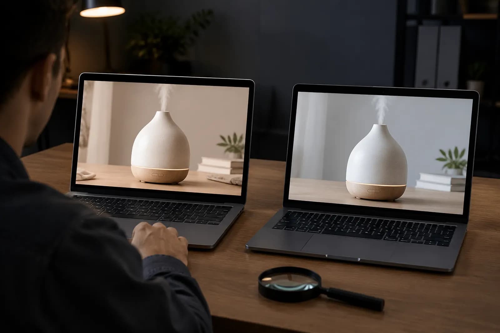
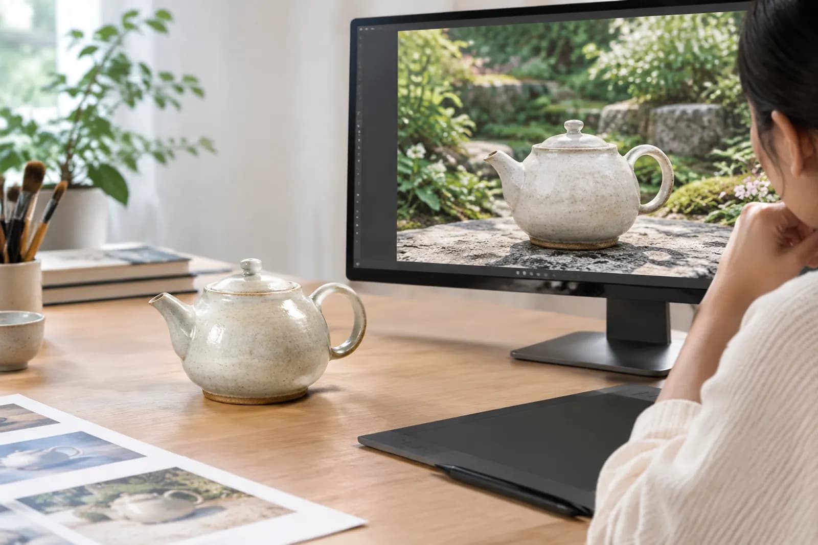
To prepare covers in different settings for several notes, start from a set of sharp real product photos, then use AI generation to place the product into different everyday scenes and pick a direction. Check lighting and scale look natural and product details match reality. To turn a square image into 3:4, extend it vertically with AI outpaint.
If you also run Douyin, compare with Douyin product card images. Both platforms reward content-led visuals, but people browse them differently.
Upload one product photo and get a full set of listing-ready visuals in minutes.
Keep reading