Advanced prompts for AI product images: describing light and materials
Change one line about light in a prompt and the same product can go from plastic to premium. Here's how we describe lighting types and common materials — glass, metal, ceramic, fabric, leather — with example prompts and fixes for the "plastic look".
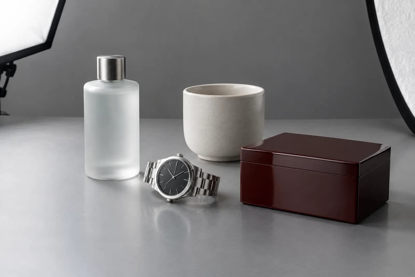
Many people stop their prompt at "product on a wooden table, living room background". The composition comes out fine, but something feels fake: glass looks like plastic, metal looks spray-painted, fabric looks like a flat print.
The problem is rarely the scene. It's light and material. In real product photography, lighting takes most of the photographer's time: where light comes from, how soft it is, whether there's a reflector, where highlights land. That's what creates texture. AI generation works the same way. The more specific your prompt is about light and material, the closer results get to a real shoot.
For basic prompt structure, start with writing prompts for product images. This is the next step: light and material only.
1. Four basic kinds of light
| Light | Effect | Suits | Keywords |
|---|---|---|---|
| Soft | Gentle shadows, smooth transitions | Most products, skincare, home goods | soft diffused light, large softbox |
| Side | Strong form, visible texture | Leather, wood, fabric weave | hard side light, raking light |
| Back | Glowing outlines, translucency | Glass, liquids, clear materials | backlight, rim light, glowing edges |
| Top | Clean, overhead feel | Flat lays, food from above | overhead light, top-down soft light |
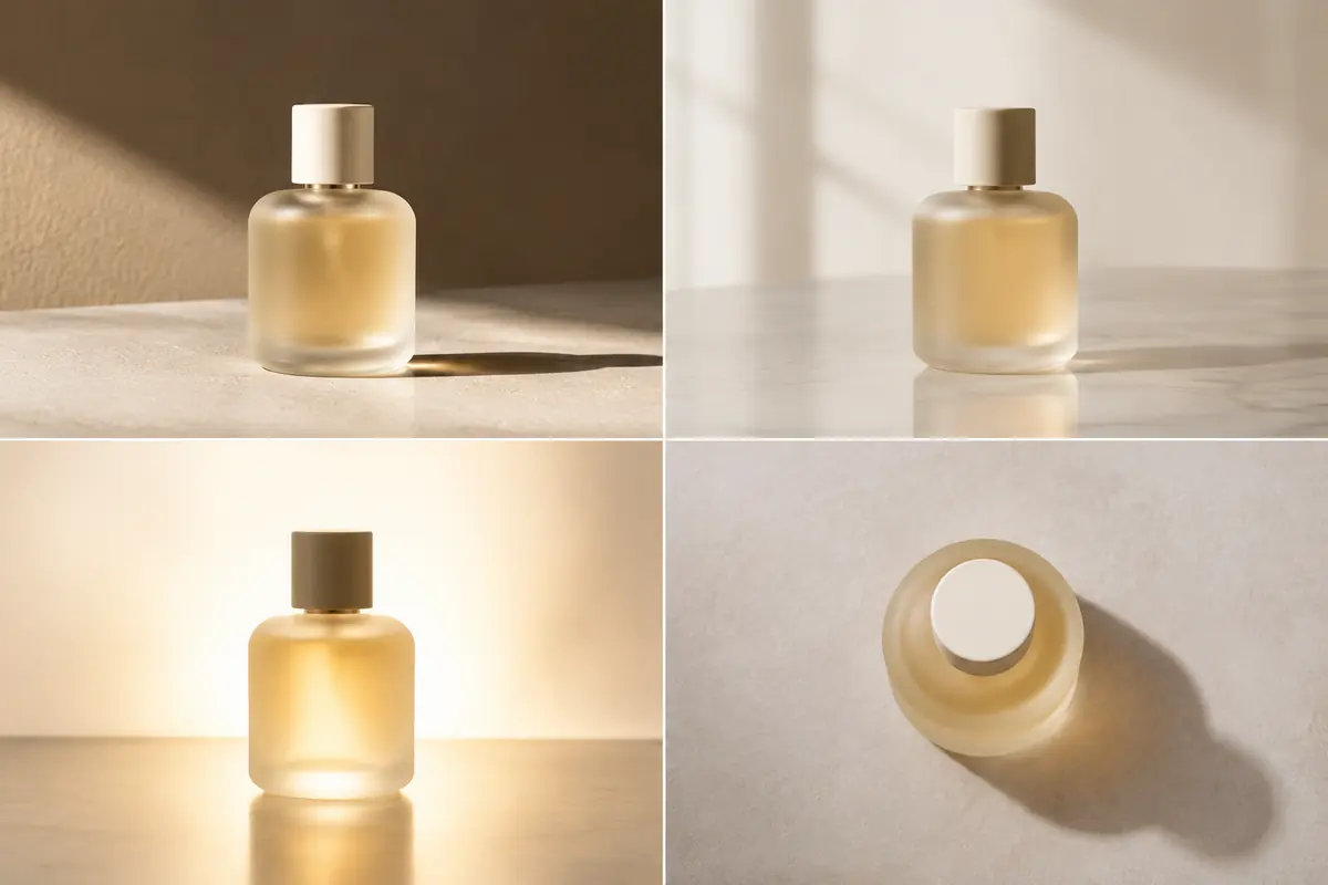
How to write it:
- Give direction — "from the left", "from behind" does far more than "nice lighting";
- Give hardness — soft versus hard shows directly in shadow edges;
- Give colour temperature — warm morning light, neutral daylight, cool light;
- Natural light counts — window light and golden hour sun suit lifestyle scenes better than "studio light".
2. Materials
Glass and transparent materials
Glass fails when it looks muddy or plastic. Real glass has bright highlight lines along its edges, slightly distorts what's behind it, and gives liquids clear colour.
Key points: backlight or side-backlight, edge highlights, a simple background (busy backgrounds turn chaotic through glass).
Example: frosted glass perfume bottle on a light stone surface, backlight creating glowing edges, soft reflection on the surface, clean light grey background, realistic product photography
Metal
Polished and brushed metal need different treatment. Polished metal mirrors its surroundings, so reflections need control; brushed metal gets its look from fine grain and soft highlights.
Key points: say brushed or polished, a long highlight from a strip softbox, nothing cluttered to reflect.
Example: brushed stainless steel watch on dark slate, long soft highlight from a strip softbox, subtle reflections, controlled contrast, macro detail
Ceramic
Matte and glazed ceramics are very different. Matte reads through gentle tonal transitions; glaze has gloss and specular points, often with colour shifts at the edge of highlights.
Example: matte white ceramic mug on a linen tablecloth, soft window light from the left, gentle shadow, visible fine texture of the glaze
Fabric
Fabric is all texture, and texture needs side light. Flat frontal light makes fabric look like a printed picture.
Key points: side light, weave texture, natural wrinkles, the fibre name (linen, cotton, wool, velvet).
Example: folded linen throw blanket on a wooden bench, low side light revealing the weave texture, natural wrinkles, warm afternoon tone
Leather
Leather's appeal is in surface grain and edge finishing. Side light shows grain; soft highlights show richness.
Example: brown full-grain leather wallet on a dark wood table, raking side light showing grain texture, soft highlight on the edges, shallow depth of field
3. Common problems and fixes
| Problem | Cause | Fix |
|---|---|---|
| Plastic look | Flat light, no highlights or texture | Add side or back light, name the texture |
| Overexposure | Light described too strongly | Drop "bright" and "strong", add "controlled", "soft" |
| Conflicting shadows | Several light sources in the scene | Describe one key light direction |
| Messy reflections | Metal or glass reflecting a busy scene | Simplify; ask for a clean background |
| Colour cast | Conflicting temperature words | Use one colour temperature |
4. A reusable structure
The structure we use most:
product + material → placement and surface → key light (direction, softness, temperature) → fill or reflector → background → style and depth of field
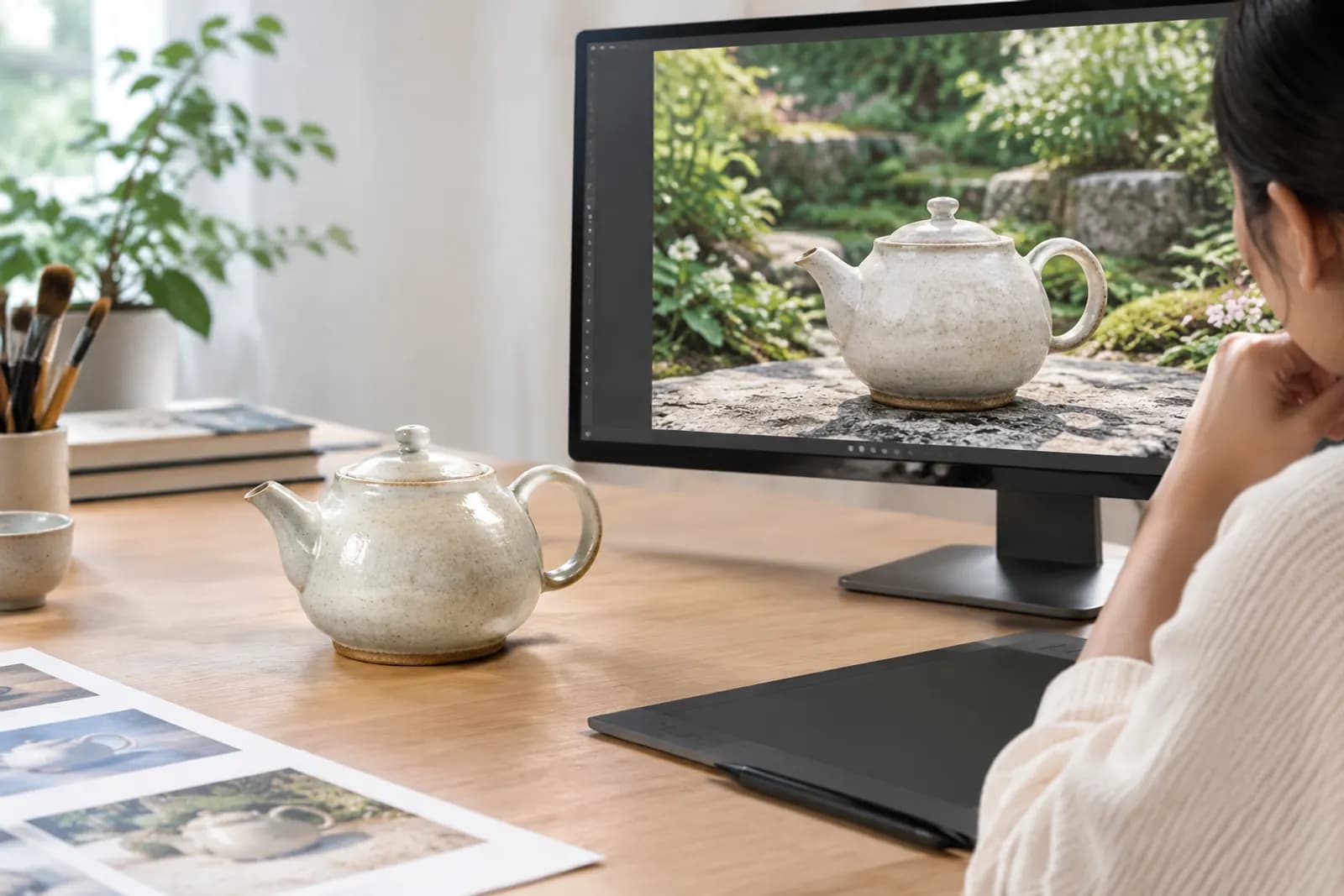
For example: ceramic teapot with celadon glaze, placed on a bamboo tray, soft window light from the left with warm tone, white reflector on the right filling shadows, plain beige wall background, realistic product photography, shallow depth of field
Fix the light and background segment as your shop's "standard lighting" and swap only product and placement each time. It's one of the most practical ways to keep brand visuals consistent.
5. Beyond the prompt
Prompts solve most problems, but remember two things:
- Product details come from real photos. Generated products can drift from the real thing; use a real product photo as input and let AI handle only scene and light.
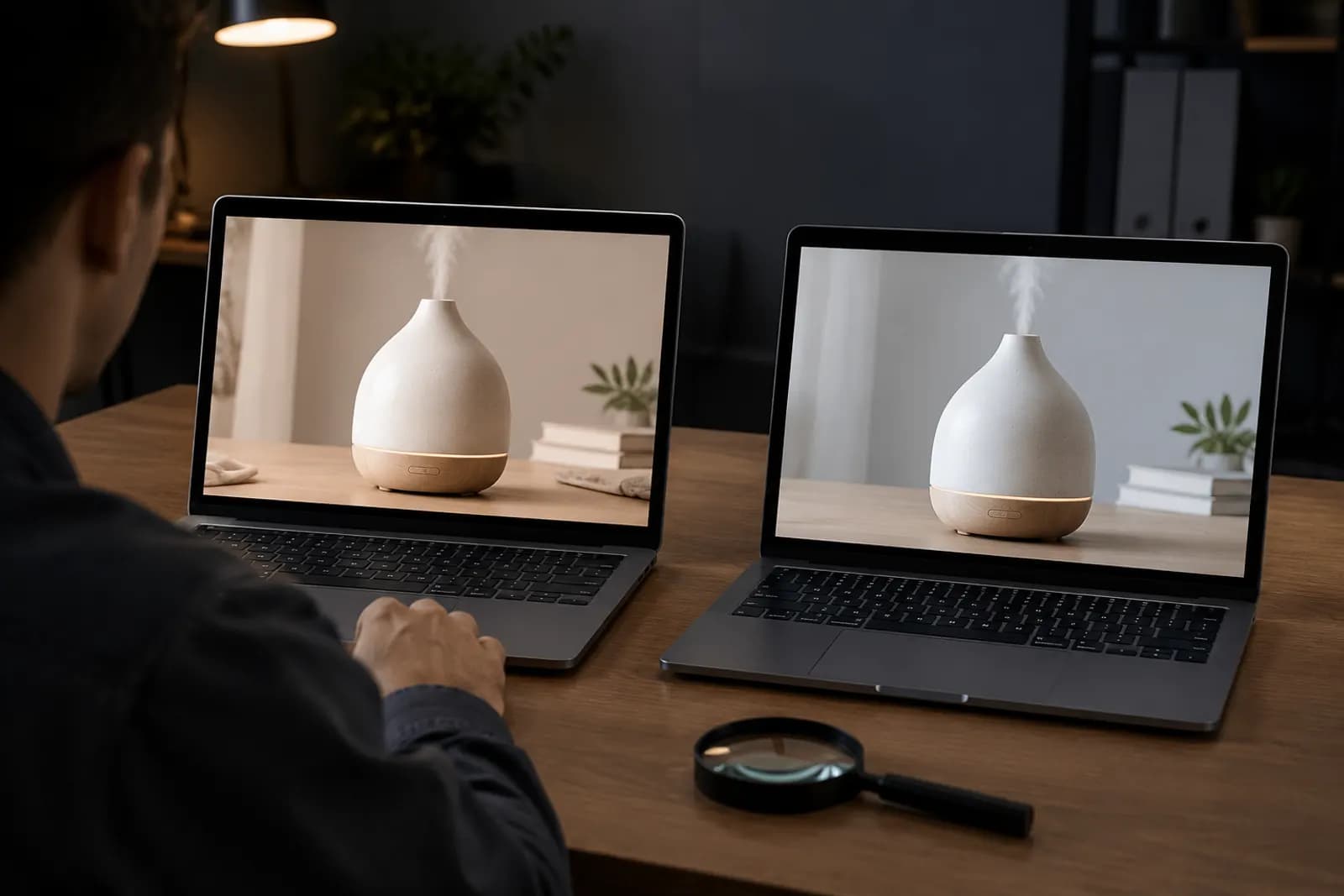
- Check every result. Zoom in on edges, text and logos for distortion, and confirm shadows agree with the light direction.
AI generation lets you upload a real product photo and apply the light and material descriptions above. If you'd rather not start from scratch, the template library has scene templates by category where you can adjust just the lighting.
Upload one product photo and get a full set of listing-ready visuals in minutes.