TikTok Shop video covers and the first second: frames, safe zones and three common mistakes
On TikTok, the first frame and the cover frame do different jobs — one stops the scroll in the feed, the other earns taps on profiles and product pages. Here's how to handle safe zones, choose cover frames and open strong.
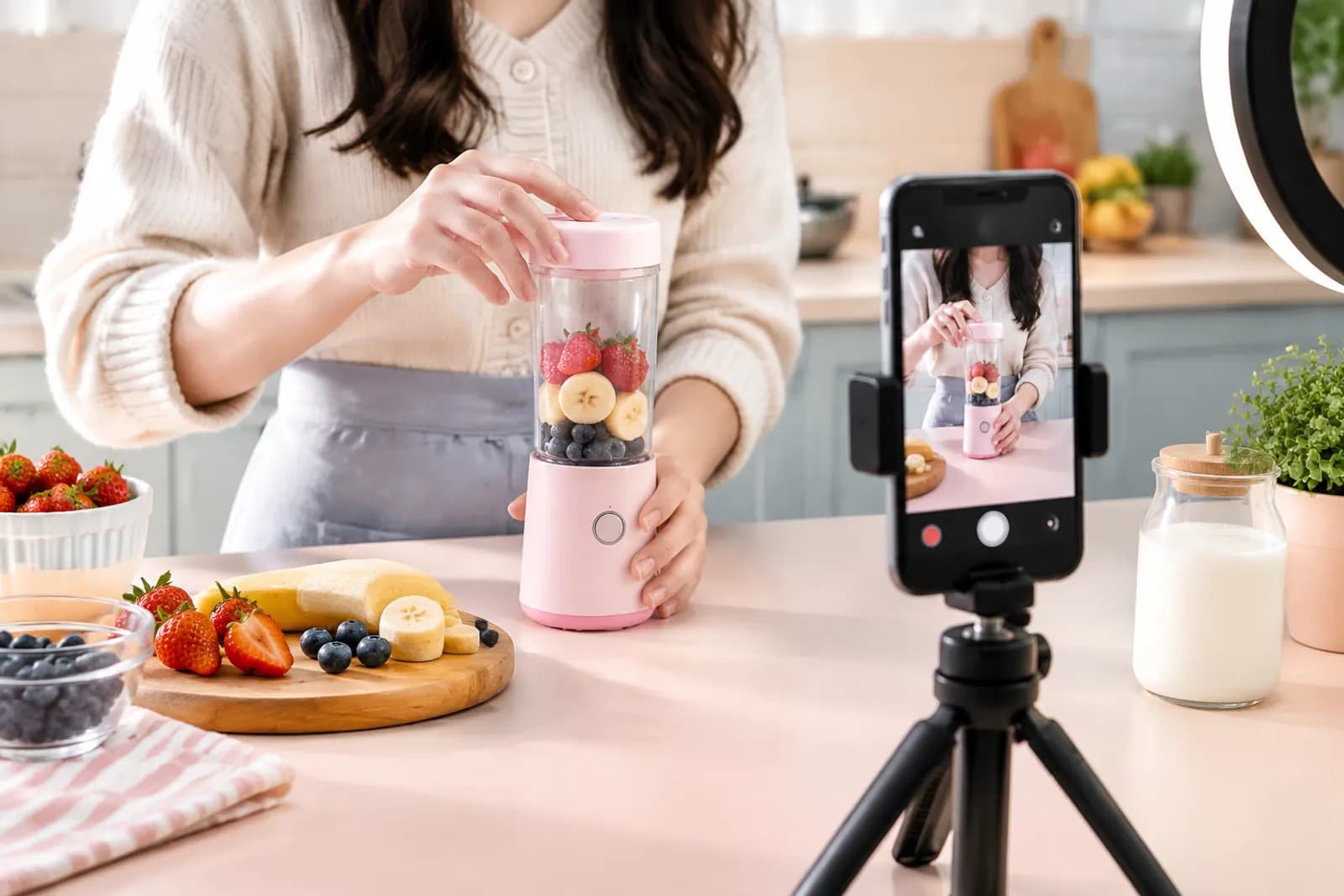
Plenty of sellers' TikTok videos are solid in the middle and weak at both ends. The product demo is fine, but in the For You feed people scroll past in under a second. Or the video lands on a profile grid or product page with a cover that's a blurry transition frame, and nobody taps.
Treat these as two separate problems:
- The first frame decides whether someone in the feed stops scrolling.
- The cover frame decides whether someone browsing your profile, search results or a product page's video section taps in.
Get the format right
TikTok is vertical. Make shop videos in 9:16, typically 1080 × 1920. Landscape uploads work, but they show with big empty bands above and below, shrinking the product until it can't compete. For current length, file size and format limits, go by TikTok Shop Seller Center and the upload screen.
Safe zones: keep the important parts uncovered
During playback, interface elements sit on top of your video:
| Area | Covered by | Advice |
|---|---|---|
| Right ~15% | Like, comment, share buttons, avatar | Keep key product parts and text out |
| Bottom ~20–25% | Username, caption, product link card | No subtitles or prices here |
| Top ~10% | Status bar, tabs | Nothing important |
The genuinely safe area is roughly the centre, slightly above middle. Product, key actions and subtitles all belong there. A transparent safe-zone overlay on your phone's viewfinder saves a lot of fixing in the edit.
The first frame: no warm-up
Feed viewers won't wait for a build-up. In the low-completion videos we've reviewed, the three most common openings were:
- The host saying hello and introducing themselves;
- A logo animation or intro sting;
- An establishing shot with little to do with the product.
Stronger openings usually take one of these forms:
- Result first — show the after, like a tile wiped clean;
- Start mid-action — the first frame is a hand already using the product;
- The problem — show a familiar annoyance, like a knot of tangled cables.
Whatever you choose, the product has to be on screen within the first second. Many viewers haven't turned sound on, so the opening has to work visually.
The cover frame: recognisable in a grid
After posting you can choose a frame as the cover and add text to it. Covers appear in your profile grid, where the thumbnail is a crop of the vertical frame — edges get trimmed — so keep the cover's subject central too.
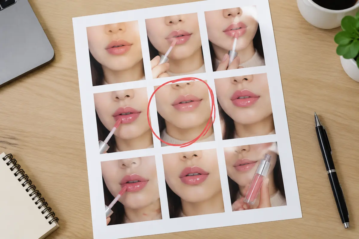
How we pick a cover frame:
- Export one frame per second and lay them out on a contact sheet;
- Discard any with motion blur, closed eyes or a hand blocking the product;
- From the rest, choose the one where the product is sharp and there's action or emotion;
- Shrink the candidates to real grid size on a phone and check the product is still recognisable.
Text on covers
Cover text helps tell videos apart in a grid: "Coffee stain gone in 3 seconds", "5 storage tricks for small flats". Some guidelines:
- One to one-and-a-half lines, large type;
- High contrast, or a translucent band behind the text;
- One consistent text style across your account so the profile looks organised;
- Only promise what the video actually shows.
Three common mistakes
Mistake one: a cover that doesn't match the video. Exaggerated covers can lift taps briefly, but completion and conversion suffer, and the content may be treated as misleading.
Mistake two: one cover template for everything. If a dozen covers in your grid look identical, nobody can tell which video covers what. Keep fonts and colours consistent; vary the image.
Mistake three: using the white-background product shot as the cover. It's ideal on a product page, but in TikTok's content environment it reads as an ad, and real-use frames usually earn more taps.
A simple routine
For a small team posting five to ten videos a week:
- While shooting, capture a dedicated "cover shot" for each video: product sharp, centred, clean background, held still for two seconds.
- Place that shot mid-video in the edit, where it doesn't hurt pacing but is easy to select as the cover.
- Before posting, log each video's opening type and cover type in a sheet. After two weeks, compare completion and tap rates and keep what works for your category.
If the product shot you want as a cover is slightly soft, export the frame and run it through Sharpen to clean up blur and compression before uploading it as the cover. For preparing product images and benefit materials for creators, see our creator asset kit guide; for how openings and visual style differ between markets, see TikTok Shop US vs Southeast Asia.
Upload one product photo and get a full set of listing-ready visuals in minutes.
Keep reading