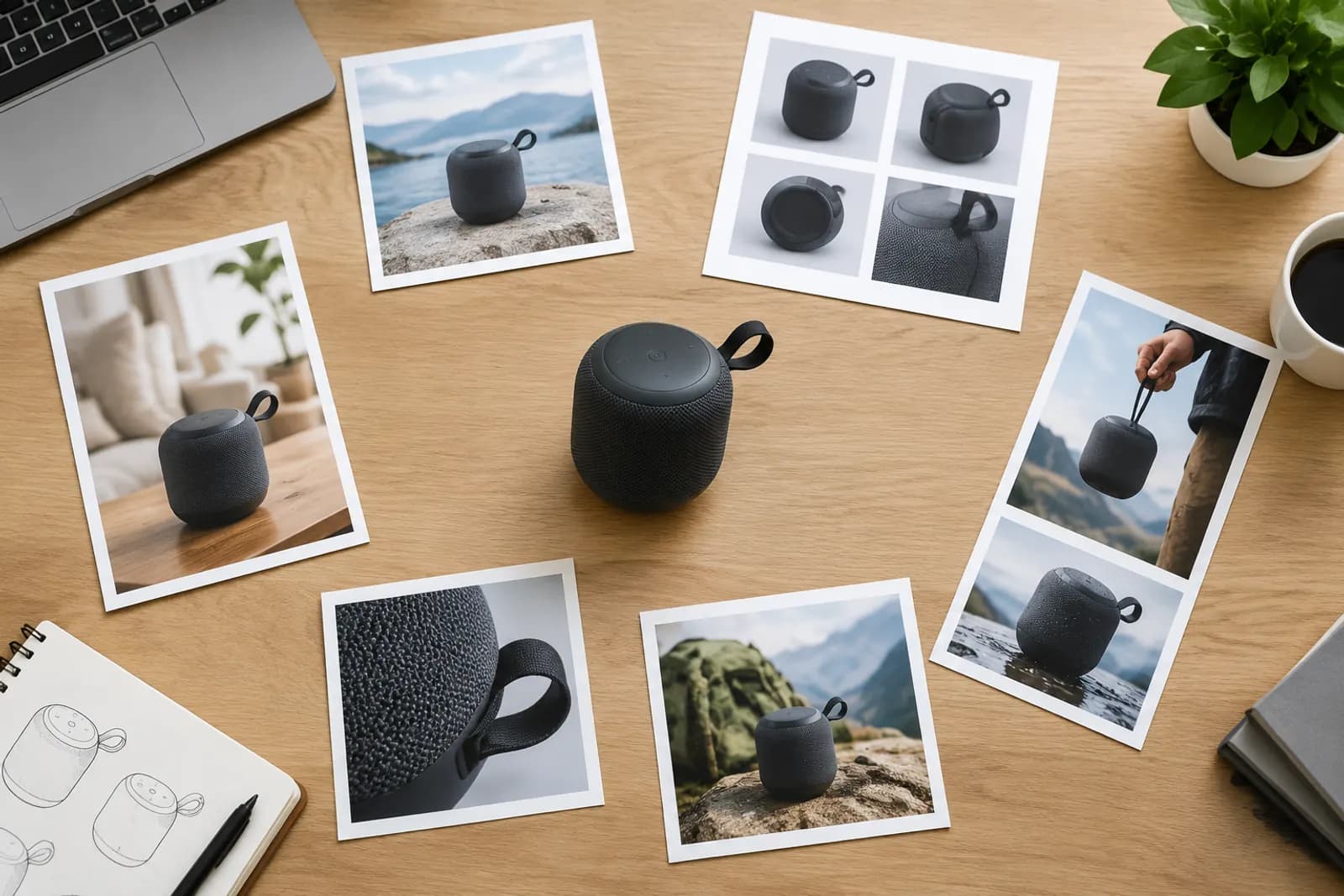
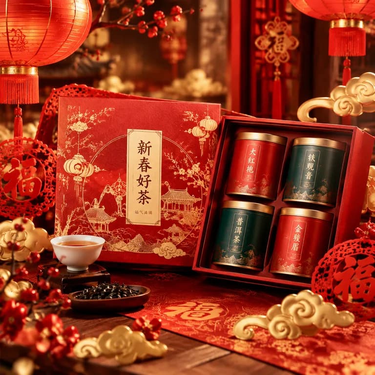
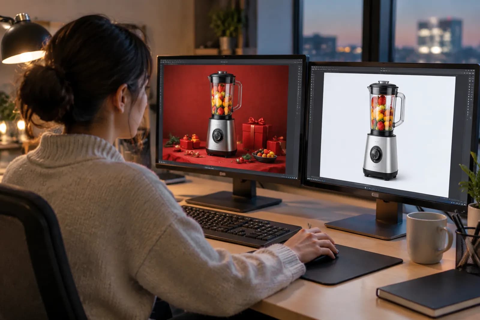
Douyin product card images: one image, two kinds of traffic
Douyin e-commerce traffic comes from short videos and livestreams on one side and the mall and search on the other. Many shoppers watch a video, then search for the product later. If your product card image doesn't look like what they saw, you lose them.
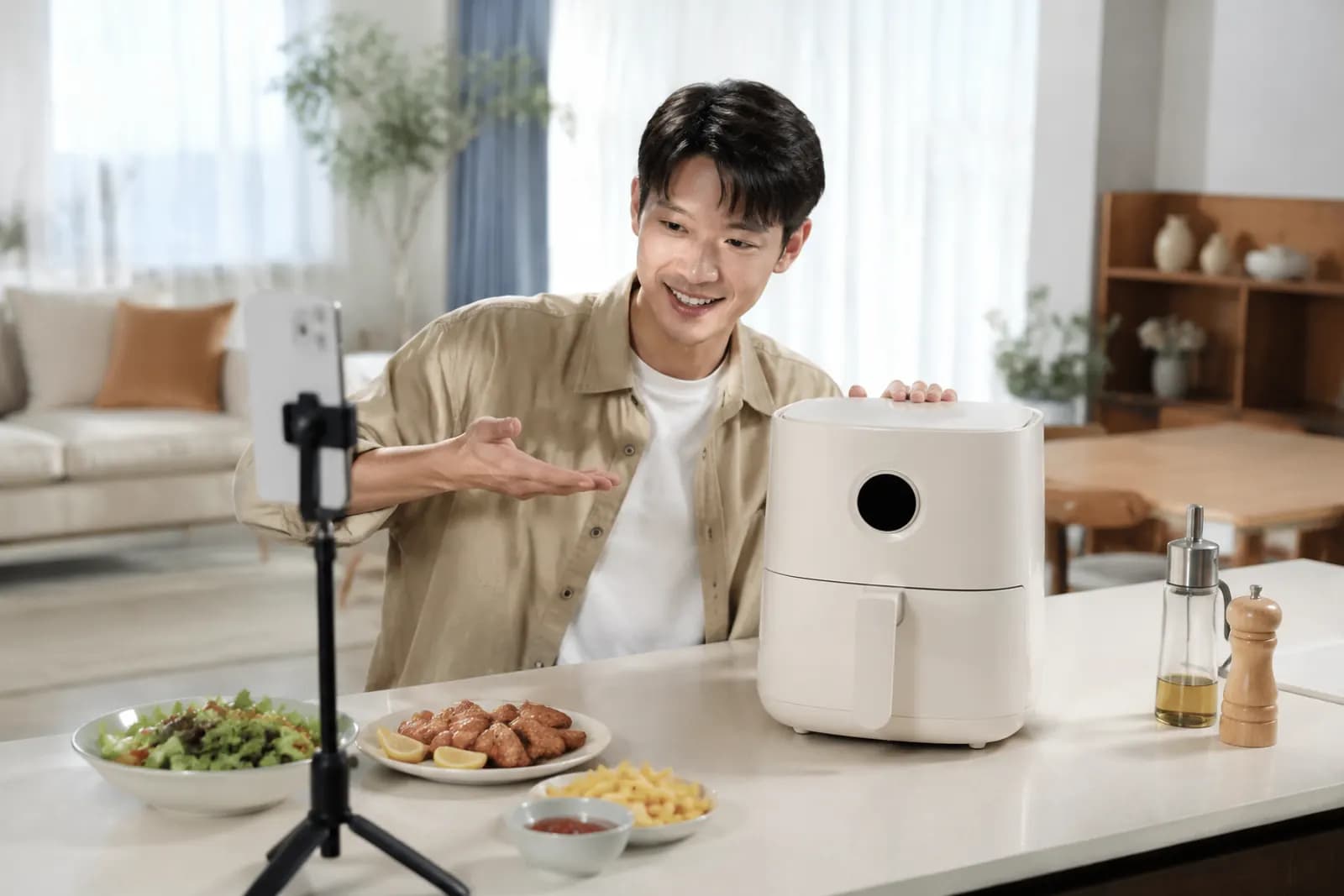
In the early days of Douyin e-commerce, almost all attention went to short videos and livestreams; the product card image was something uploaded in passing when linking a product. That has changed. "Shelf" placements — the mall, search, shop pages — now bring meaningful traffic, and the product card image directly affects those sales.
More importantly, the two kinds of traffic are linked. Plenty of users see a video, don't buy, and later type a keyword into search to find "that thing from earlier". If your product card looks nothing like the product in the video, they may not recognise it and buy someone else's.
Two settings, two ways of looking
| Content (video, live) | Shelf (mall, search, shop) | |
|---|---|---|
| User state | Drawn in by content, passive | Clear need, actively looking |
| What they see | Video, live room, product pop-up | Product card images in a list |
| Decision basis | Creator explanation, demos | Image, price, sales, reviews |
| Image's job | Confirm "that's the one" | Earn the tap in a list |
So the product card image must do two things: let people who saw the video recognise it instantly, and make people who didn't see it want to tap.
Consistency: make the image look like the video
Viewers who search later remember the video: a colour, an angle, a way of using it. Match that memory:
- Same colour — use the colour the video featured for the first image;
- Similar angle — the angle that recurs in the video is a good reference;
- Keep the key element — if the hook was "folds to palm size", show it folded;
- Same name — the product name spoken in the video should match title keywords so people can find it.
One counter-example we saw: a portable fan whose video featured the cream colour worn around the neck, while the product card showed the black version front-on on white. The video did well, but search conversion was poor. After switching the first image to cream, worn around the neck, search conversion clearly improved.
Earning the tap in shelf placements
In the mall and search, product cards compete much as on traditional marketplaces:
- Clear subject — the product fills most of the frame and survives shrinking;
- One benefit — one short line at most, in large type;
- A hint of life — Douyin users respond well to everyday scenes, which feel friendlier than plain white (a white-background image is still needed separately);
- No banned wording — absolute claims and unprovable effects are off-limits in images too.
Specs and white-background images
Common practice for Douyin shop main images (check the back end and category rules for current requirements):
- Main images are usually 1:1; apparel and some categories support 3:4;
- Aim for 800px or larger;
- Upload a white-background image as required for some recommendation and campaign placements;
- A main video can be added, and vertical video feels natural on Douyin.
White-background requirements resemble other platforms: pure white, product complete and centred, no text or watermark. AI cutout handles these in batches.
Apparel: 3:4 and models
Apparel is a major Douyin category. 3:4 portrait main images show full-length models better and feel closer to vertical video. Suggestions:
- Use the same style and colour as the video for the first image, ideally the same or a similar model;
- Include one flat lay or hanging shot to show the garment's cut;
- Put sizing on its own image, with measured values.
Testing
Promotion tools can give product cards shelf exposure, which suits small tests:
- Prepare two or three first images that differ on one variable — white vs scene, front vs in use;
- Run them with identical budgets and settings for a few days;
- Compare tap-through and purchase conversion and keep the winner.
Avoid big price changes or new videos during the test.
Pulling main images from video
Many shops have far richer video footage than product photos. One practical trick: take key frames from your best-performing videos and use them as product card material. Frame grabs are usually low resolution, so run them through HD upscale to 1200px or more before cropping and retouching. The resulting image naturally matches the video.
For video covers and openings, much of TikTok Shop video covers and the first second applies to Douyin; for livestream set design, see setting up livestream room visuals.
Upload one product photo and get a full set of listing-ready visuals in minutes.
Keep reading