One photo, three ratios: using AI outpaint for 1:1, 3:4 and 9:16 — and when to reshoot instead
Taobao wants squares, Xiaohongshu 3:4, Douyin covers 9:16, store banners something very wide. Cropping cuts into the product; AI outpaint extends the scene instead. Here's how to choose settings, which images extend well, and what to check afterwards.
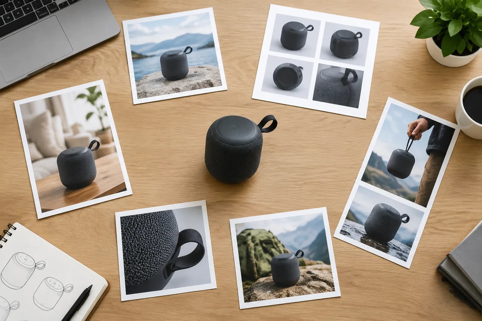
The same scene image often needs to work in several places: 1:1 for a Taobao main image, 3:4 for a Xiaohongshu cover, 9:16 for a Douyin video cover, and a very wide ratio for the store banner.
Cropping is the quick answer, but cropping can only take away. Crop a 9:16 portrait from a square and you lose most of the sides, possibly part of the product; crop a banner from a portrait and the top and bottom go.
AI outpainting works the other way: it keeps everything in the original and generates new content around it, stretching the canvas to the target ratio. Here's how to use it well.
Two ways to extend
AI outpaint offers two modes:
| Mode | How it works | Suits |
|---|---|---|
| Target ratio | Pick a ratio; the system works out direction and amount | When you know the ratio you need, like 3:4 or 9:16 |
| Expand edges | Extend chosen sides by a set amount, e.g. 15% each | Adding breathing room, or extending one direction only |
Edge expansion comes in small (15%), medium (30%) and large (50%), and you can choose any combination of top, bottom, left and right.
Common conversions
| From | To | Extend | Use |
|---|---|---|---|
| 1:1 | 3:4 | Top and bottom | Xiaohongshu covers, Douyin product images |
| 1:1 | 9:16 | Top and bottom (a lot) | Short-video covers, vertical posters |
| 1:1 | 16:9 | Left and right | Landscape video covers, detail page banners |
| 3:4 | 1:1 | Left and right | Taobao and JD main images |
| 1:1 | Ultra-wide | Left and right (a lot) | Store homepage banners |
Going from 1:1 to 9:16 means generating a lot of new content above and below — more area than the original. Large extensions are less predictable; more on judging that below.
Describing the new area
You can describe what the extended area should contain. It makes a big difference:
- No description — the system continues what's at the image edges; best for simple backgrounds;
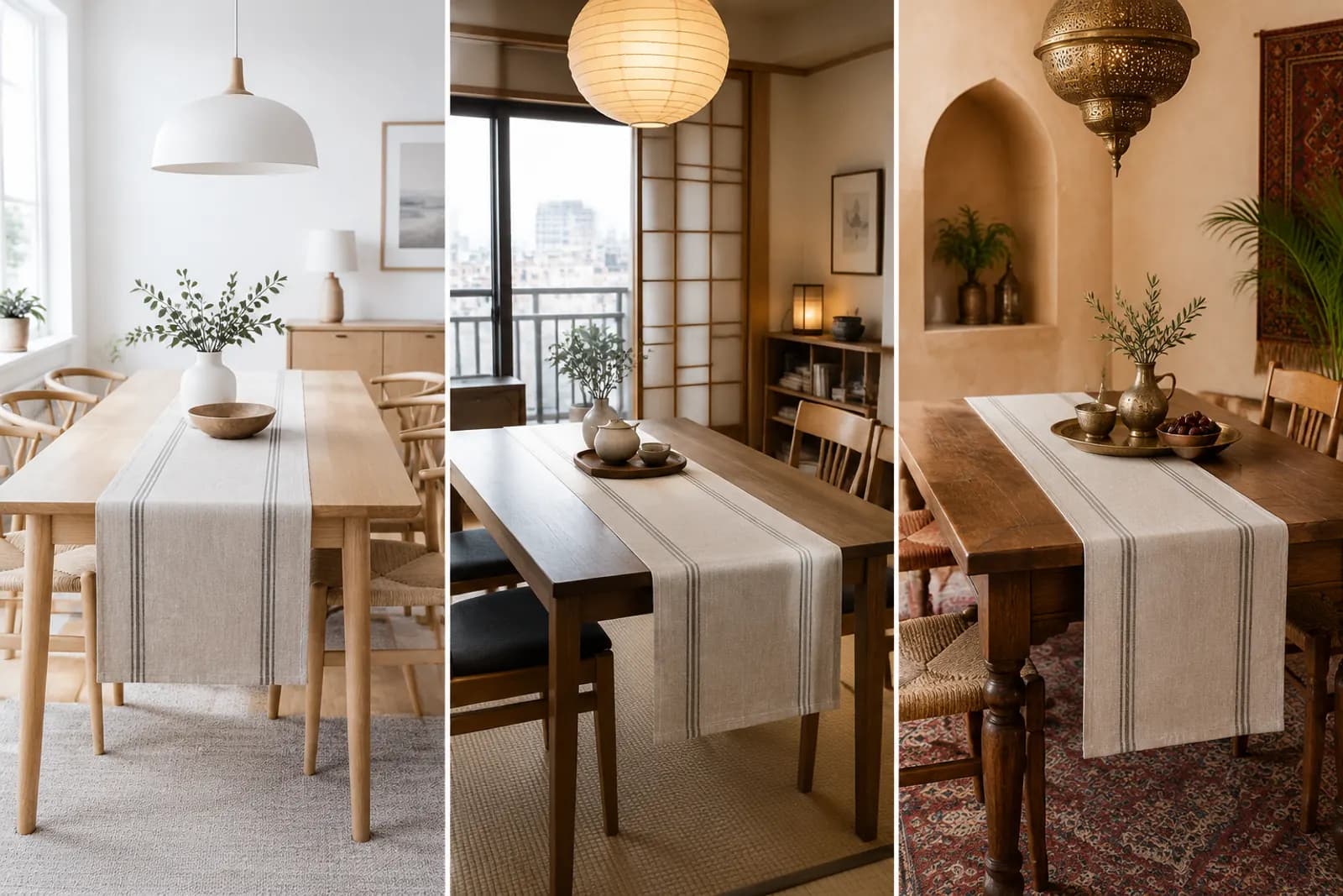
- With description — e.g. "wooden table and plants, soft daylight", when you want scene elements added.
Keep the description consistent with the original's light and style. If the photo has warm afternoon window light, don't ask for "cool studio light", or you'll get a visible seam.
Our rule of thumb: above, ask for simple things like wall, window or sky; below, table or floor; to the sides, matching décor or plain space. Don't ask for complex objects — people, text, other products — in extended areas.
What extends well, and what doesn't
Good candidates
- Product shots on plain or simple backgrounds — the most reliable;
- Natural backgrounds such as walls, tables, grass or sky, with regular texture;
- Product centred with some space around it.
Poor candidates
- Product touching or cut off by the edge — outpainting has to invent the missing part, which may not match the real product;
- Backgrounds with lots of regular lines — tiles, bookshelves, window frames — that rarely line up;
- People cut off at the edge — generated body parts can distort;
- Extensions much larger than the original.
The first case matters most: outpainting must never be used to complete the product itself. Generated product parts are imagined and may differ from reality, which misrepresents what you sell. Reshoot instead.
Post-outpaint checklist
- Seams — any visible line, colour shift or blur where original meets extension;
- Light — shadow and light direction consistent;
- Perspective — table and floor lines continuous;
- Odd objects — warped items, stray text or meaningless patterns;
- Product untouched — nothing about the product changed;
- Safe areas — for video covers, product clear of interface overlays.
A worked example: one scene, four sizes
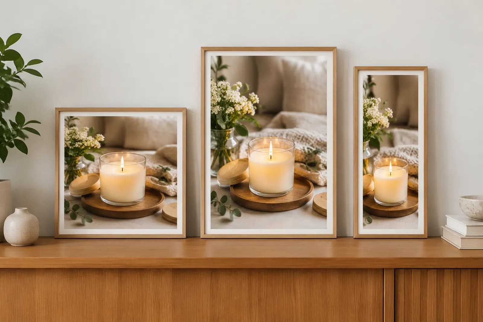
We took a 1:1 scented candle scene (on a wooden sideboard with plants) and made four versions:
- 1:1 original — Taobao main image;
- 3:4 — extended upward with wall and part of a picture frame, for a Xiaohongshu cover;
- 9:16 — extended a lot above and below, wall on top, sideboard doors below, for a Douyin cover. Review showed slight repetition in the wood grain, so we switched to "mostly upward, a little downward";
- Ultra-wide — extended left and right with more sideboard and empty space, for the store homepage.
The 3:4 and ultra-wide versions worked first time; 9:16 took two rounds. That fits the general pattern: the larger the extension, the more checking and adjusting it needs.
Afterwards
Changing ratio can change resolution; if you need more detail, run the result through HD upscale. For platform-specific covers, see Xiaohongshu note covers and Douyin product card images.
Upload one product photo and get a full set of listing-ready visuals in minutes.
Keep reading