Setting up livestream room visuals: background, lighting, product display and overlays
In the first two seconds after someone lands in a livestream, they judge the picture, not the pitch: is it clear, can I see the product? Here's a practical checklist for small sellers covering background, lighting, camera position, display and overlays.
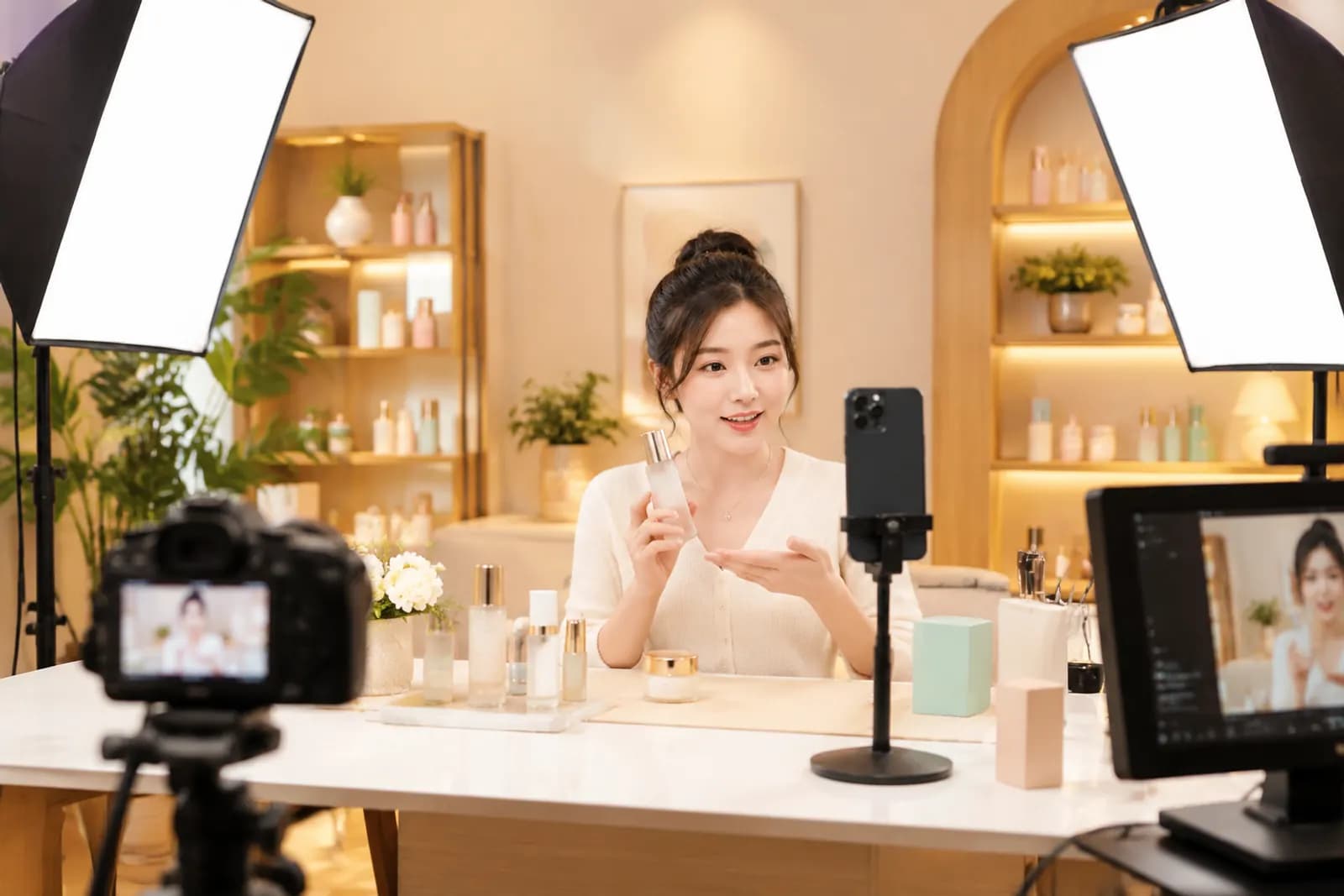
Live commerce is crowded, and when someone swipes into a livestream from a feed, they decide whether to stay in a second or two. The host may not have finished a sentence. The judgement rests almost entirely on the picture: is it bright, is it sharp, where's the product, does this look professional?
Many small sellers invest heavily in scripts and product selection, while the room itself is still a table, a white wall and a ring light. This guide breaks the room into five parts, each with steps you can follow.
1. Background: clean, layered, never louder than the product
The background is the first impression:
- Contrast with the product — darker backgrounds for pale clothing, lighter or warmer backgrounds for dark appliances;
- Add depth — a flat white wall looks thin; shelves, plants and brand displays add layers;
- Don't overdo it — busy wallpaper or giant slogans compete with the product;
- Match the brand — soft, clean tones for skincare; brighter energy for snacks.
A simple test: screenshot the room on a phone, shrink it to feed size, and see whether it's obvious what's being sold.
2. Lighting: three lights solve most problems
Lighting decides picture quality, and it's where cutting corners shows most. A basic three-light set-up:
| Light | Position | Job |
|---|---|---|
| Key | In front of the host, off to one side, slightly above head height | Lights face and product, sets overall brightness |
| Fill | In front, on the other side, dimmer than the key | Softens shadows from the key |
| Rim / background | Behind the host or above the backdrop | Separates host from background, adds depth |
Details that matter:
- One colour temperature — around 5000–5600K daylight for all lights, so one side isn't yellow and the other blue;
- Diffusion — softboxes or diffusion cloth to avoid hard shadows and glare on faces and products;
- Light the product separately if the display area is away from the host;
- Avoid harsh overhead light — ceiling lights cast shadows under the eyes; switch them off or dim them.

3. Camera: framing for vertical
Major live platforms are mostly vertical, 9:16. You have limited width for host and product:
- Host — centred, slightly high, with a little headroom;
- Product zone — the table in front; products raised to chest height should stay inside the safe area;
- Avoid covered areas — comments sit at the bottom, interaction buttons on the right;
- Close-ups — for beauty, jewellery and food, add a second camera or phone for texture and detail.
Keep the camera at or slightly above the host's eye line. Shooting down feels oppressive; shooting up catches the ceiling.
4. Product display: show what else there is
Products on display are part of the background and a hint of the range:
- Hero products in the most visible spot — by the host's hand or centre of the backdrop;
- Group collections neatly by colour or size so the range reads at a glance;
- Moderate quantity — too many looks messy, too few looks empty;
- Face the camera — packaging fronts and logos forward, with no glare.
5. Overlays: informative, not chaotic
Overlays — price info, campaign rules, perks — help viewers understand quickly, but they're also where screens get messy:
- Placement: top or side empty space, never over the host's face or the product, never in the comment or button zones;
- Quantity: two or three at once;
- Size: bigger than you think, to be readable on a phone;
- Accuracy: prices and offers must match the linked product and be updated when a promotion ends. Follow advertising law and platform rules — no unprovable "lowest price anywhere".
Set-ups by category
| Category | Background | Lighting focus | Watch out for |
|---|---|---|---|
| Beauty & skincare | Soft, light | Even on the face, clear texture | Colour accuracy; heavy beauty filters distort shades |
| Apparel | Simple, room for full length | Even full-body light | A full-length shot to show fit |
| Food | Warm, homely | Warm tones, appetite appeal | Texture, and a visibly clean environment |
| Electronics & appliances | Clean, modern | Control screen and metal glare | Clear demos, close-up camera |
| Jewellery | Dark | Point lights for sparkle | A close-up camera is essential |
An upgrade path for small sellers
Not everyone can build a full studio at once. In order of impact:
- Fix lighting first — a diffused key light improves brightness and clarity the most;
- Tidy the background — clear clutter, add a shelf for display;
- Add a close-up camera — a phone dedicated to product detail;
- Finally refine overlays and brand elements.
Keep the room's look consistent with your main images and short videos, so moving from video to live room to product card feels like one shop. For practical ways to do that, see our brand visual consistency guide. And for backdrop artwork or display concepts, AI generation can mock up a few directions before you build the real set.
Upload one product photo and get a full set of listing-ready visuals in minutes.
Keep reading