The Amazon Brand Story module is a cross-ASIN shelf most sellers waste
Brand Story shows up on every ASIN you apply it to, yet most brands fill it with a generic company bio. Its real job is moving shoppers from one product to the rest of your range.
"Brand Story" is a slightly misleading name. Sellers read "story", write a paragraph about being founded in some year and committed to quality, add a photo of the factory gate — and nobody reads it.
We find it more useful to think of Brand Story as a horizontal brand navigation bar. It sits above the A+ content (check the live page for exact placement), and one build can be applied across many ASINs in your brand. From any single product page, a shopper can reach your other products, your Store, and a reason to trust you.
How it differs from A+
| A+ content | Brand Story | |
|---|---|---|
| Topic | This one product | The brand and its range |
| Job | Convert this ASIN | Get shoppers to browse more ASINs or visit the Store |
| Reuse | Usually built per ASIN | One build across many ASINs |
| Format | Vertical modules | Horizontal carousel of cards |
Once that clicks, you stop repeating product benefits in the Brand Story and stop writing brand philosophy in A+.
Structure: a background and a row of cards
A Brand Story is one background image plus a set of cards. The common card types:
- Logo & description: your logo with a short brand line;
- Image & text: a portrait image with a headline and a few sentences;
- Four-image quadrant: four small squares for product lines or scenes;
- ASIN showcase: direct links to other products in your brand;
- Store showcase: links into pages of your Brand Store.
The background is typically 1464 × 625 pixels, and the card images are much smaller. The editor states the exact size for every upload slot; follow that.
One practical detail: the first card covers the left side of the background and later cards cover the right, so very little of it is ever fully visible. Don't put anything important in the background. A texture or scene in your brand colours is enough.
Card order: a reason first, then somewhere to go
The sequence we use most:
- Logo and one-line positioning. Not "high quality" but a specific promise, like "storage designed for small apartments".
- One "why us" card. A real differentiator, such as your own material testing or a construction method you refuse to compromise on.
- A quadrant for the range. Four categories or collections, one image each.
- Two or three ASIN showcase cards. Push the products you most want traffic on — usually new launches or your best-margin items.
- A Store showcase card for shoppers who want to see everything.
It's the same logic a good in-store salesperson follows: earn trust, then show what else there is. Putting ASIN cards first usually performs worse than leading with a reason.
When your brand doesn't have a "story" yet
Plenty of cross-border brands are only a couple of years old. Don't invent a heritage. Amazon is wary of claims it can't verify, and shoppers spot it anyway.
There's usually more true material than you think:
- How you choose products — for example, every item is used at home for 30 days before launch;
- The specific problem you solve — say, furniture protectors designed for homes with pets;
- Your process — inspection steps, packaging changes, how you handle after-sales;
- Changes driven by reviews — like redesigning a storage box clip after customer feedback.
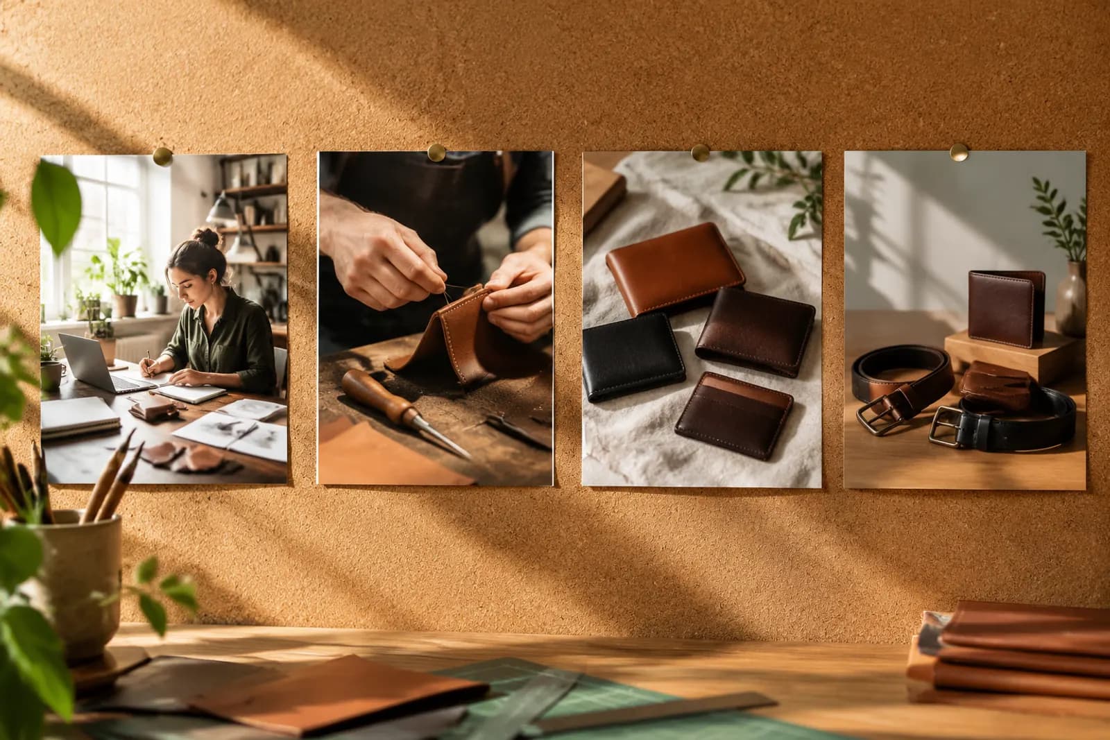
Show these with real photos: the workbench, the samples, the testing. They don't need to be polished. They do need to be real.
Copy: short enough to scan
People swipe through Brand Story quickly. Keep each card's headline to one line and the body to two or three sentences. On English-language marketplaces especially, avoid adjective piles — "premium quality, innovative design" carries almost no information here.
A quick test: cover your brand name and ask whether the copy would still be true for any competitor. If it would, it isn't specific enough yet.
Keep the visuals consistent
Brand Story, A+, your Store and your main images should share one visual language. Rules you can actually apply:
- Pick one or two primary colours and one or two accents, and draw the background and card colours from them;
- Keep lighting consistent across lifestyle shots — natural window light throughout, not warm amber in one and cool blue in the next;
- Shoot products at a consistent angle so the range looks like a family when shown together.
We cover Store layout separately in our guide to designing an Amazon Brand Store, and module selection in choosing A+ standard modules.
Preparing card images with AI
The quadrant and image-and-text cards need a lot of lifestyle images in a matching style, and that's where the time goes. One approach is to take a scene you're happy with and use Style replication to carry its light and colour across other products, then keep only the most natural results. For anything that claims to show real testing or your actual team, use real photos. That's where the trust comes from; swapping it for generated images defeats the point.
Upload one product photo and get a full set of listing-ready visuals in minutes.
Keep reading