Designing a store homepage mobile-first: five modules that say what you sell and where to look
Many store homepages are one long poster with nothing findable at the bottom. Using Taobao and Tmall mobile stores as the example, here's a module order, what each module needs, common banner mistakes, and how to tell if the homepage is working.
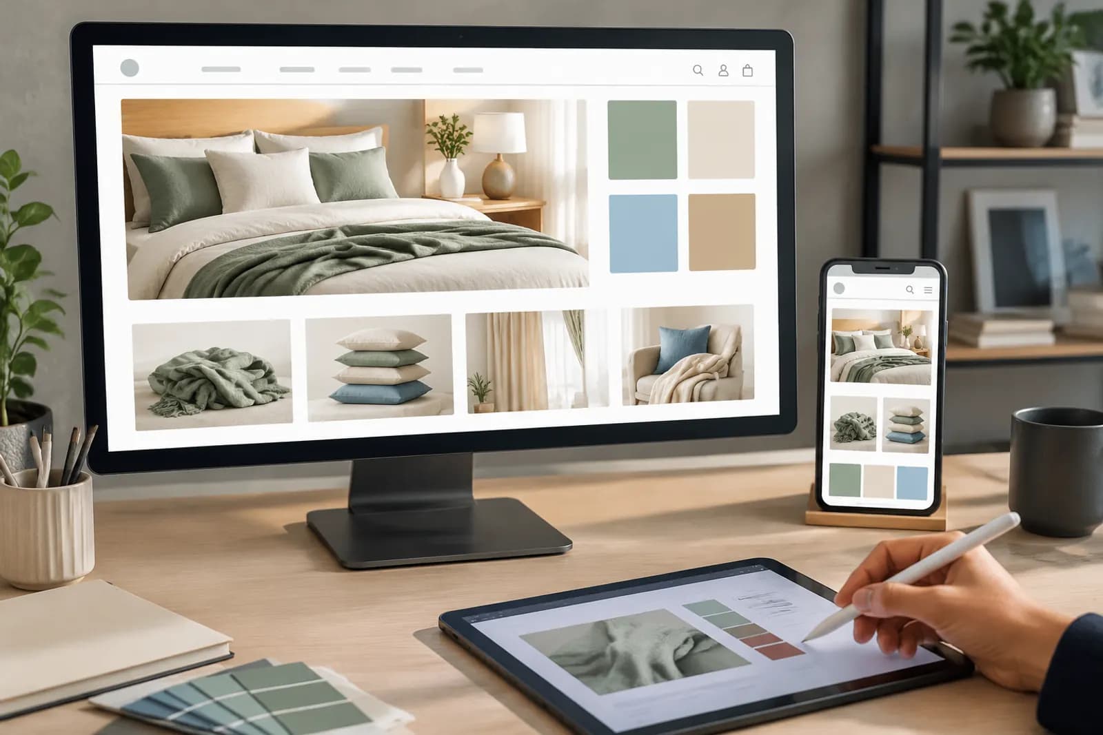
The store homepage used to be where e-commerce designers spent the most effort: screen after screen of posters, elaborate animations, a full redesign for every holiday. Things have shifted. Most shoppers now arrive straight on product pages from search and recommendations, and homepage traffic has shrunk as a share.
That doesn't make the homepage unimportant. The people who do visit are usually interested in the shop: returning customers, people who liked one product and want to see more, people searching within the store. They tend to be more ready to buy. The homepage's job is to help them find things fast, not to show them a poster.
Mobile first
Most visits come from phones, so design and review the homepage on mobile:
- Design width: mobile store design commonly uses a 750px canvas; follow the module notes in the store builder;
- One focus per screen: phone screens are small;
- Large text: poster text shrinks on a phone;
- Keep it short: if shoppers swipe five or six screens without seeing products, many leave.
A recommended module order
| Order | Module | Purpose |
|---|---|---|
| 1 | Shop header | Tell shoppers whose shop this is |
| 2 | Hero banner (1–3 slides) | The single most important thing now: launch, sale or hero product |
| 3 | Category navigation | Route shoppers who know what they want |
| 4 | Featured / best sellers | A shortcut for ready buyers |
| 5 | New arrivals / collections | Show returning customers what's new |
| 6 | Brand content / membership | Story and member perks, further down |
The logic: the higher up, the more it serves quick decisions; the lower, the more it serves people who want to explore.
Shop header: keep it simple
The header is small. The usual mistake is cramming in logo, slogan, discounts and a follow button. It needs two things: your logo and, optionally, one line of positioning. Discounts belong in modules below.
Hero banners: three at most, one idea each
The hero carousel is the most visible spot and the most abused:
- One to three slides — almost nobody sees slide four;
- One idea per slide — one launch, one sale, one collection, not three products and four offers;
- Big product — the product is the focal point, not buried under type and decoration;
- Clear hierarchy — one headline, one subline, at most one call to action;
- Update on time — expired campaign banners are the biggest drag on a homepage.
Banner style should match the rest of the shop; see our brand visual consistency guide for unifying colour and type.
Category navigation: use shoppers' words
Navigation decides whether people find what they came for:
- Name categories with search terms, not internal collection names — "insulated bottles" beats "XX Series";
- Four to eight categories usually; more stops being navigation;
- Consistent images — one representative product per entry, with matching background, angle and fill;
- Consider grouping by room or use — living room, bedroom, kitchen often beats grouping by material for home goods.
Featured and new-arrival modules
Featured products drive homepage conversion. Main images work fine here, but:
- Keep image styles consistent within a module — all white or all scenes;
- Use a moderate number — two per row on mobile, four to eight per module;
- Price and title are shown by the platform; don't repeat them in the image.
New arrivals mainly serve returning customers, as a dedicated banner or a set of consistently styled product cards.
Measuring whether it works
The store builder and analytics tools show homepage visits, module clicks and attributed sales. Compare two to four weeks before and after a redesign, looking at:
- Whether homepage bounce rate fell;
- How clicks spread across modules — if almost nobody uses category navigation, the names may be unclear;
- Whether product visits and sales from the homepage rose.
Avoid comparing across major sales; event traffic behaves very differently.
During big sales
Homepages usually switch to an event version for major sales:
- Prepare it in advance and switch the day before;
- Keep "one idea per screen" even during a sale; don't pile everything on;
- Switch back to the everyday version as soon as the event ends.
For campaign scheduling, see our Double 11 visual war room.
Preparing assets
You'll need hero banners, category entry images and collection scenes. Draft several banner layouts with the campaign main image tool and have a designer refine copy and detail. For consistent category images, AI cutout can place every product on the same background colour.
Upload one product photo and get a full set of listing-ready visuals in minutes.
Keep reading