Taobao's five main images: from the click-earning first image to the white-background slot and video
On Taobao, the first main image earns the click, the next three decide whether shoppers add to cart, and the white-background image affects recommendation placements. Here's what each slot should do, plus 3:4 apparel images and main videos.
Most Taobao sellers know the layout: up to five main images per product, plus a main video. Far fewer give each image a distinct job. Typically the first image is carefully designed and the other four are screenshots from the detail page — or all five make the same point from slightly different angles.
Each slot plays a different role in how shoppers browse. Designing to those roles works better than designing for looks.
The specs first
These are the settings we commonly use. Requirements vary by category and change over time, so check the seller centre before publishing:
| Item | Common setting |
|---|---|
| Ratio | Mostly 1:1; apparel and some categories can use 3:4 portrait |
| Size | 800 × 800px or larger enables zoom; we aim for around 1200px |
| Count | Up to 5 main images |
| White-background image | Pure white, product complete and centred, no text, logos or collages |
| Format | JPG and PNG are common |
Image 1: its only job is the click
The first image appears in search results, recommendation feeds and campaign pages. Its job is to get opened among a row of competitors. We ask three questions:
- Shrunk to phone list size, is it still obvious what it is? The product should fill 60% or more of the frame.
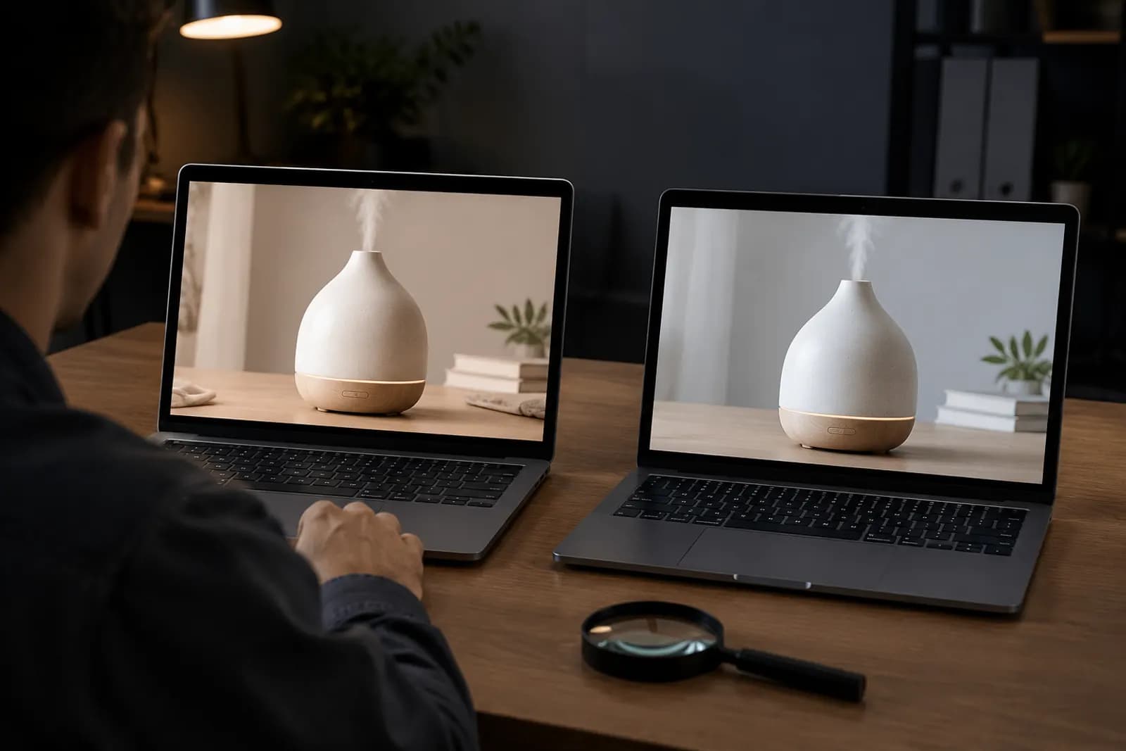
- Next to competitors for the same keyword, does it stand out? Screenshot a results page and drop your image in.
- Is there a reason to tap? One core benefit, a visible result, or a clear hint about who it's for.
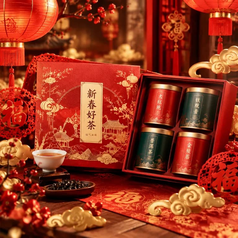
Keep text on the first image restrained. Many shops pile on "hot seller", "best" and "limited time". China's Advertising Law restricts absolute claims like "best" and "number one", and a wall of text is unreadable at thumbnail size anyway. One benefit in large type usually beats five.
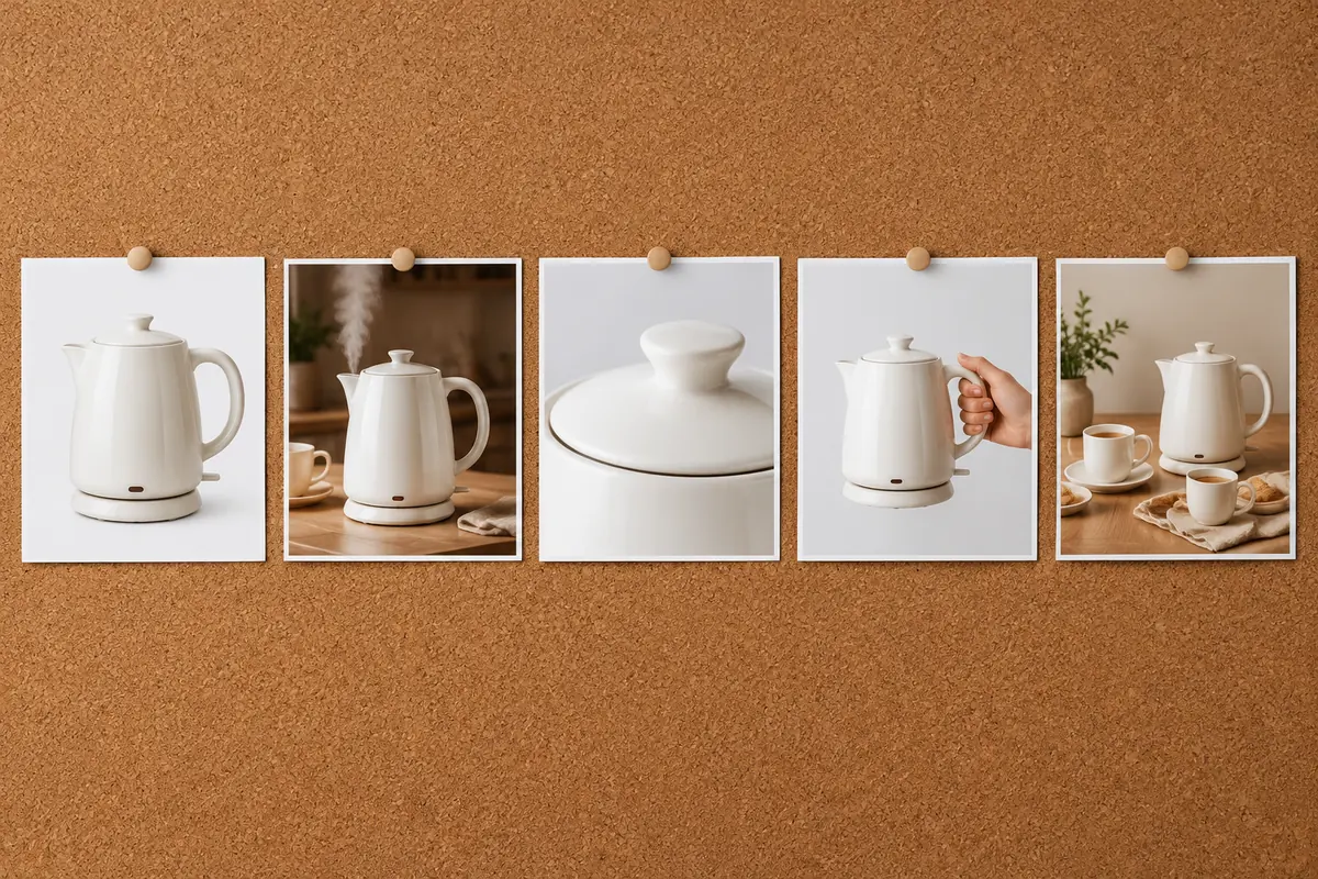
Images 2–4: answer "should I add to cart?"
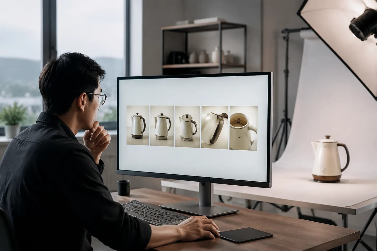
When shoppers land on the product page, the first thing most do is swipe through the main images. Those few seconds decide whether they scroll on or go back. Images 2–4 should answer their top questions in order. For an electric kettle:
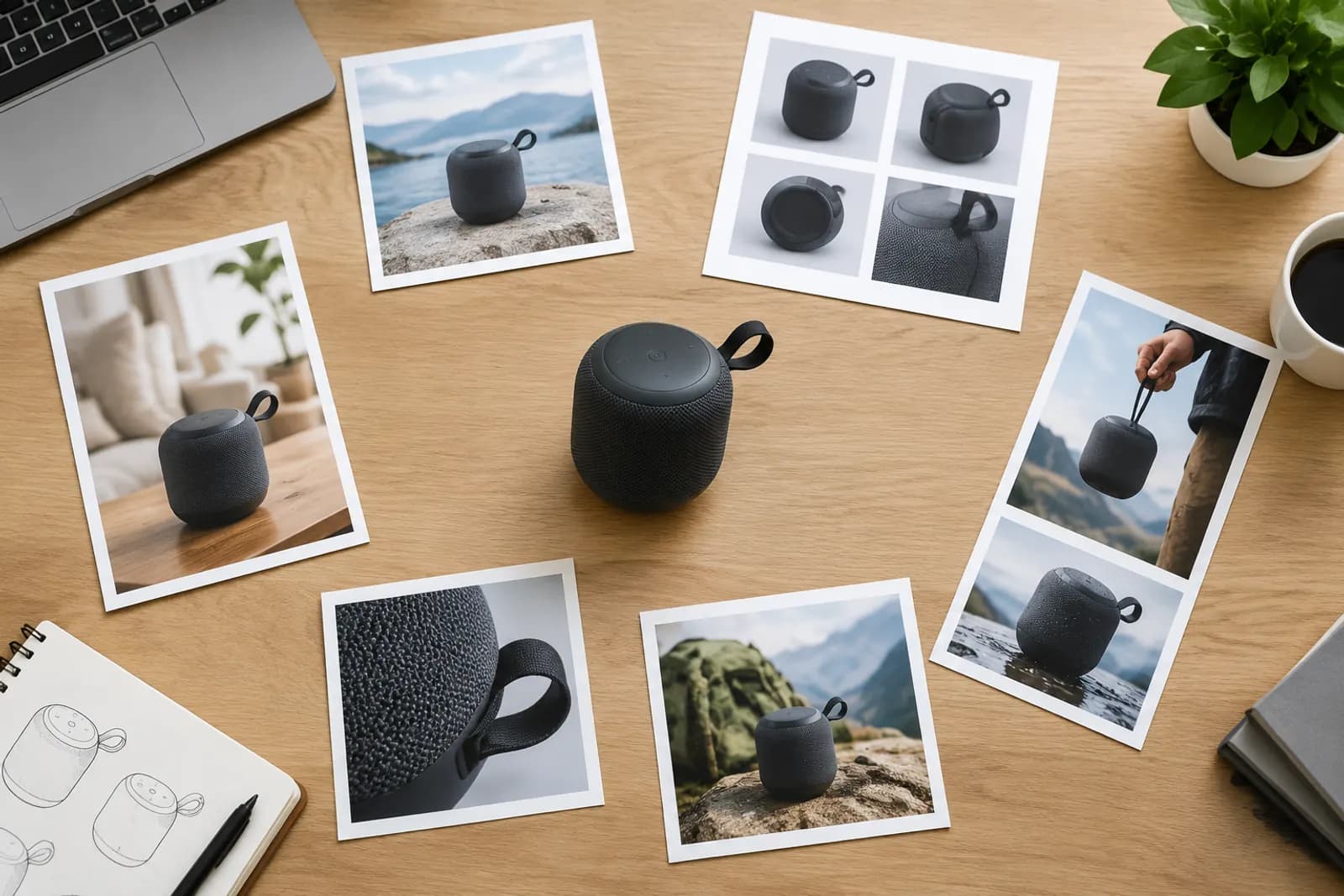
- Image 2: proof of the core benefit. "Boils in 5 minutes" shouldn't just be words; show steam and a timer.
- Image 3: in use. A real kitchen counter, so shoppers can picture it at home.
- Image 4: detail and build. The lid seal, the spout, the base material.
If the product comes in several colours or sizes, one of these can become an overview of options so shoppers don't need to dig into the SKU selector.
Image 5: the white-background image
Slot 5 usually holds the white-background image. Beyond the product page, it's used by the platform when pulling assets for some recommendation and campaign placements, so a non-compliant one can cost you visibility there.
Common requirements:
- Pure white background, no shadows, gradients or stray colour;
- Product complete, uncropped and centred;
- No text, logos, watermarks or collages;
- A single product (sets follow category rules);
- Clean edges — no white fringes or jagged cutout lines.
Edges are where these images fail. Fluffy, transparent or reflective products leave a grey halo on white if the cutout isn't clean. Output white backgrounds with AI cutout, then check edges at 100%.
3:4 main images for apparel
Apparel, shoes and bags can use 3:4 portrait main images, which show full-length model shots far better than squares. Keep in mind:
- All five images for one product should share one ratio;
- Search and some placements may still crop to square, so keep the model and key product areas central;
- You still need a separate white-background image.
The main video: the first three seconds
The main video usually autoplays muted in the main image area. Follow the platform's length limits; in practice we keep videos under 30 seconds and put the key information in the first three.
- The first frame is the product — no intro or logo animation;
- Show benefits visually rather than relying on voiceover, since many shoppers never turn sound on;
- Match the main image ratio to avoid black bars;
- The product in the video must match the main images exactly.
Pre-launch checklist
- First image still clear at phone list size;
- Restrained text, no absolute claims;
- Images 2–4 each answer a different question;
- White-background image compliant with clean edges;
- One ratio across all five;
- Video opens on the product;
- Product colour matches the real item in every image.
Working faster
Five images plus a video is real work for a shop launching every week. Choose the Taobao preset in Product image sets to plan white-background, benefit, scene and detail images by slot, then check the results against this list. For improving first-image click-through over time, the six click factors in our e-commerce main image guide apply on Taobao too.
Upload one product photo and get a full set of listing-ready visuals in minutes.
Keep reading