Raising Pinduoduo click-through: value at a glance in a two-column feed
On Pinduoduo, most products are seen in a fast two-column feed by price-conscious shoppers. Your main image has a tiny space to say "this is worth it". Here's how to layer information, express value within the rules, and shoot fresh produce and household goods.
Pinduoduo's traffic works differently from other platforms. Many products are discovered in the two-column recommendation feed, search lists and campaign channels, where shoppers scroll quickly and almost everyone is comparing prices.
So a Pinduoduo main image has one core task: in a small square, make someone feel within half a second that it's worth it. Not beautiful, not premium — worth it.
How the two-column feed displays products
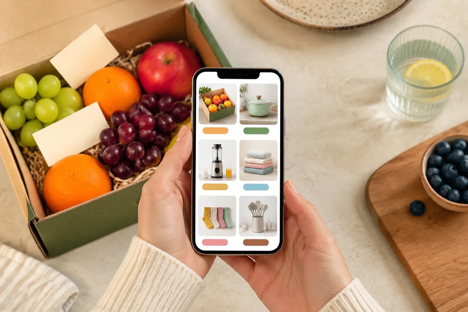
On a phone, each product in a two-column feed takes up roughly half the screen width, with title, price and sales count beneath it. That has direct consequences:
- Fine detail is invisible; only the main subject and large colour areas register;
- Small text on the image can't be read;
- Price is shown by the platform below the image, so shoppers see both together.
The goal is to make the subject and the core message big enough — not to fit in more information.
Hierarchy: one subject, one benefit, one proof
Our structure for Pinduoduo main images is simple:
| Layer | Content | Share of frame |
|---|---|---|
| Subject | The product, or its visible result | 60–80% |
| Benefit | One line, two at most | Large, high contrast |
| Proof | A visual of quantity, size or effect | Supporting |
Examples:
- Tissues: a stacked case is the subject, "X packs per case" (accurate) is the benefit, and the stack itself is the proof;
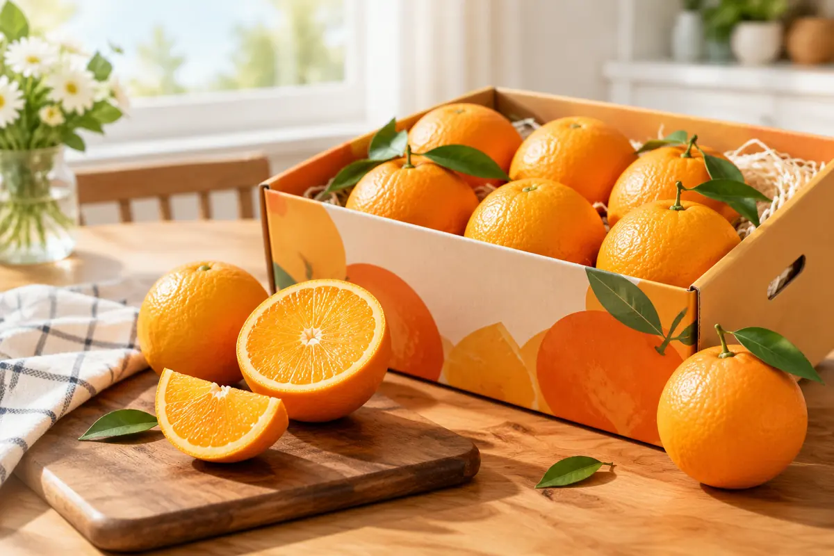
- Fruit: cut flesh is the subject, origin or variety is the benefit, juice and texture are the proof;
- Storage boxes: a filled box is the subject, capacity or size is the benefit, the tidy result is the proof.
Showing value
Value isn't only a low price. More often it's shown through quantity and quality:
- Quantity: for household goods and snacks, show the full case or multipack so buyers see how much they get — and the quantity shown must match what ships;
- Scale: use familiar references like a hand, a coin or a water bottle;
- Quality: cut surfaces and juice for produce, material close-ups for household goods;
- Real homes: genuine household settings feel warmer than plain white and stand out in a feed.
Limits on price and promotion
Many Pinduoduo main images show a price or a pack count. Some boundaries:
- Prices in the image must match the actual price. With several SKUs, showing only the cheapest option's price can feel misleading;
- No invented original prices or inflated discounts. Comparisons need a basis;
- Avoid absolute claims banned by China's Advertising Law, such as "cheapest" or "lowest anywhere";
- Platform campaign badges are added by the platform. Don't imitate them in your own artwork.
Specific rules — which text is allowed, what counts as clutter — vary by category and campaign; follow the merchant back end.
Fresh produce: real beats retouched
Produce is a huge category on Pinduoduo with its own rules of thumb:
- Authenticity first. Over-retouched fruit looks plastic and invites suspicion. Keep natural skin texture and small imperfections.
- Show the inside. Buyers want to know it tastes good; cut flesh and running juice are the most direct evidence.
- Show grade. Distinguish large and medium fruit with a hand or familiar object for scale.
- Orchard scenes go later. Farms and picking work well in images two and three; keep the first image on the product.
One caution: if real fruit varies in size and colour, don't photograph only the best-looking piece. The gap at delivery turns straight into bad reviews.
Testing: small and fast
Pinduoduo feedback comes quickly, which makes it good for testing. Prepare two or three first images with different ideas, run them on a small promotion budget, and keep the best performer after a few days.
- Change one variable at a time — angle, benefit line or background colour;
- Keep budget and timing consistent;
- High click-through isn't high conversion; watch orders too.
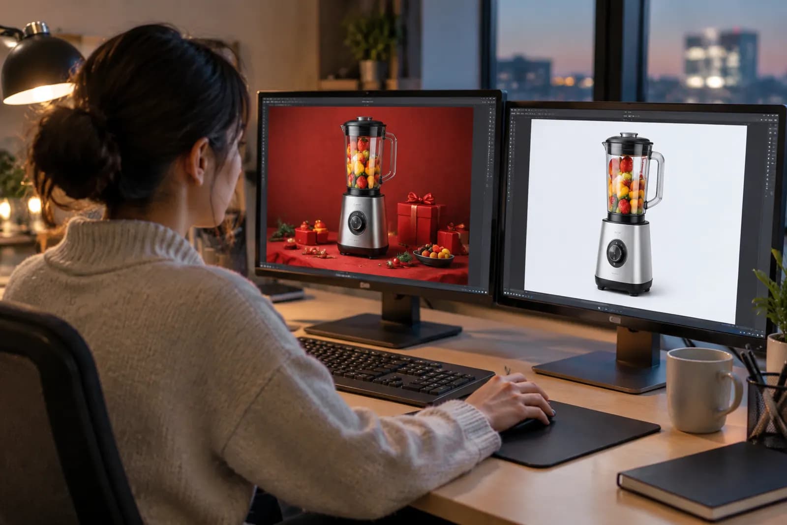
For quick variants, AI generation can produce different scenes and background colours from one real product photo. Be especially careful with produce: flesh colour, size and texture must match reality. Use generated versions to test direction, and real photos for the final listing if in doubt.
After the click
The click is only step one. The expectation your main image sets has to be met on the product page, or more clicks just mean more bounces. For the product page's opening screen, see designing the first screen of a detail page; for general click factors, see our e-commerce main image guide.
Upload one product photo and get a full set of listing-ready visuals in minutes.