Brand visual consistency for online shops: a one-page standard for hundreds of product images
As a shop grows, its images come from different photographers, agencies and years, and the storefront starts looking like several shops stitched together. Here's how a one-page visual standard unifies colour, light, composition and type — including for AI-generated images.
When a shop opens, one person usually shoots and edits everything, so images look consistent by default. Once the catalogue grows from dozens to hundreds of SKUs, sources multiply: the photographer from year one, the agency from year two, supplier images, phone shots taken by the operations team. On the storefront some images are cool and some warm, some white and some grey, some covered in text and some with none.
Shoppers won't analyse the differences, but they'll get a vague sense that the shop is a bit messy. When prices are similar, that feeling quietly affects trust.
What consistency actually means
Brand consistency doesn't mean every image looks the same. It means they look like they belong to one family:
| Layer | Keep consistent | Free to vary |
|---|---|---|
| Colour | Primary, accent and background colours | The products' own colours |
| Light | Direction, softness, colour temperature | Specific equipment |
| Composition | Product fill, angle, margins | Exact arrangement |
| Type | Fonts, size hierarchy, placement | Copy |
| Scenes | Style and the feel of props | Specific settings |
The one-page standard
Every shop should have a one-page visual standard. Not a 40-page brand book — one page that answers the key questions:
1. Colour
- One primary colour for key text, icons and buttons;
- One or two accents to pair with it;
- Two or three background colours — pure white for white-background images, a fixed set for scene and benefit images;
- Hex values for each, like #2F5D50.
2. Light
- Key light direction, e.g. always from top left;
- Softness, e.g. always soft light with gentle shadow edges;
- Colour temperature, e.g. neutral to slightly warm;
- Shadows on white-background images: a slight contact shadow or none — pick one for the whole shop.
3. Composition
- Product fill on white-background images, e.g. about 80%;
- A standard angle, e.g. 45° three-quarter;
- Product position in scenes, e.g. centred, slightly low.
4. Type
- One headline font and one body font;
- A fixed size hierarchy for headline, subhead and body;
- Placement, e.g. benefit text always in the top third.
5. Scenes and props
- Style keywords, e.g. "natural, wood, early window light";
- Prop materials and colours, e.g. wood, linen and ceramic, no plastic or shiny metal;
- Banned elements, e.g. no cartoon stickers or starburst badges.
Print it and put it on the studio wall and next to the designer's desk. It beats any verbal brief.
Holding the line with agencies and multiple people
More sources mean more drift. Practical safeguards:
- Give reference images, not just words — two or three "standard samples" for each image type (white background, scene, benefit) that agencies match;
- Check deliveries against the standard — colour, light direction, product fill; send back what doesn't fit;
- Keep a shared asset library — backgrounds, props and icons in one place for everyone;
- Spot-check monthly — randomly review newly listed images for drift.
Keeping AI output on-brand
Generating scenes and benefit images with AI is now common, and it brings its own consistency problem: light, tone and style can shift with every generation. What helps:
- Fixed prompt structure — turn the light, tone and scene keywords from your standard into a fixed prompt segment used every time. See writing prompts for product images;
- Lock style with a reference — pick the image that best fits your standard and use Style replication so new images carry its light and colour;
- Save templates — keep styles you like as templates instead of re-tuning each time;
- Human review — screen results against the standard and discard what doesn't fit.
Fixing an established shop in stages
A shop with hundreds of products can't redo everything at once. The order we suggest:
- Homepage and hero products first — the images shoppers see most;
- Then products in the same collection — inconsistency is most obvious side by side;
- New launches follow the standard strictly from today;
- Long-tail products get replaced gradually.
Start with white-background backgrounds and shadows and a standard product angle. Both are cheap to change and transform the storefront more than anything else.
Example: a tea shop
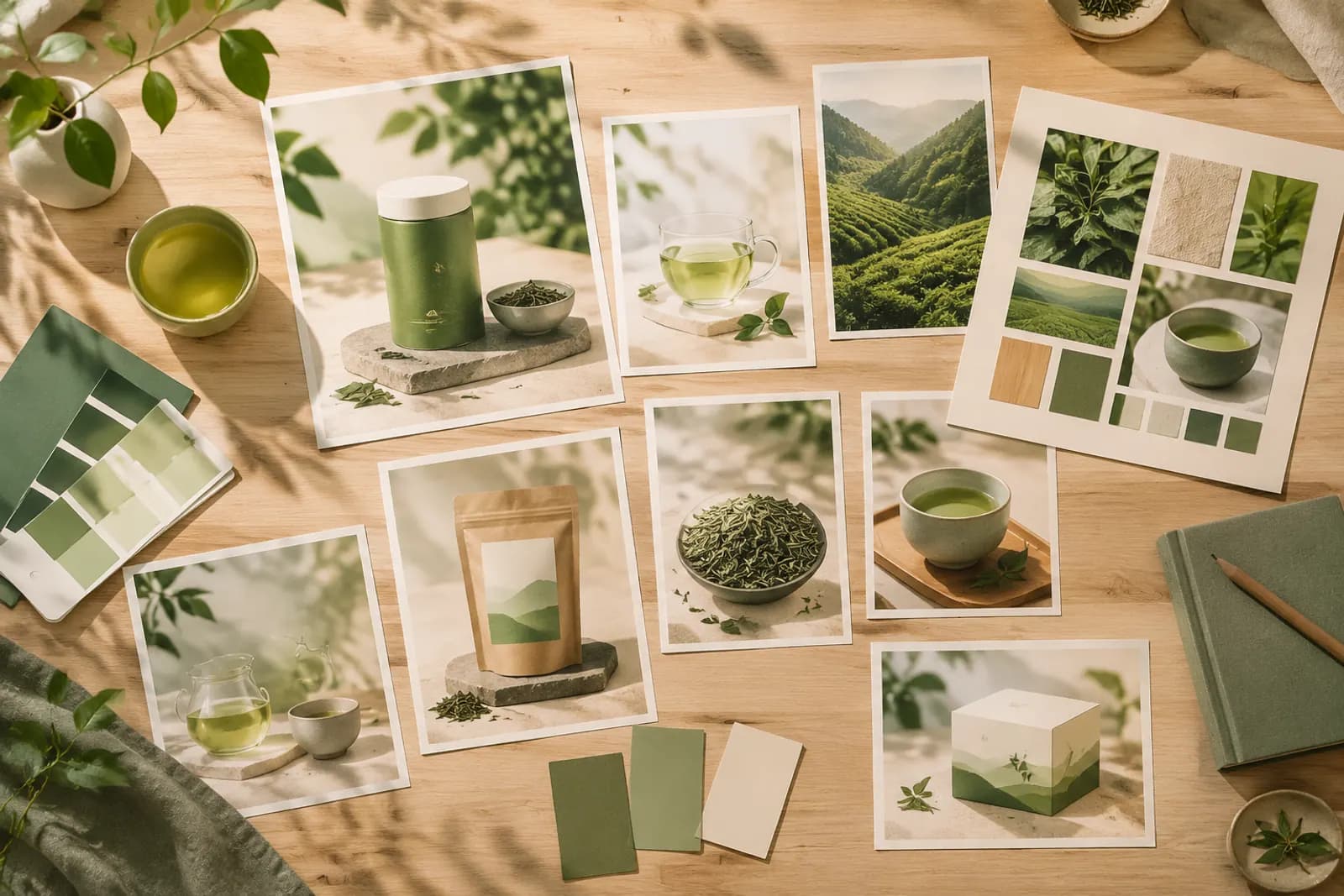
A tea shop with over 40 products had images from three eras: early phone shots, a hired photographer, and recent agency designs. They wrote a one-page standard first: deep green as primary, backgrounds chosen from warm white and pale sage, light always from a window on the left, props limited to ceramic teaware and linen.
They then replaced images in three batches: eight hero products, fifteen in the same collections, then the rest. After the first batch the homepage already felt noticeably more coherent. Most of the work was reshooting white-background images and rebuilding scenes; benefit images only needed unified fonts and colours.
Standards evolve
Update the standard as the brand grows — seasonal colour shifts, a direction for a new collection — but record every change and tell everyone who produces images. For storefront and homepage layout, see designing a store homepage.
Upload one product photo and get a full set of listing-ready visuals in minutes.
Keep reading