Amazon Sponsored Brands creative: shooting and checking custom images and video
Sponsored Brands placements are small and moderation is stricter than on your detail page. Here are the common specs for logos, custom images and video, why ads get rejected, and how to design video for muted autoplay.
Great detail-page images don't automatically make good ads. Sponsored Brands ads sit at the top of search, mid-page or on product pages, in a small space, in front of people who haven't decided to look at you yet. They need creative that reads at a glance, not creative that rewards close inspection.
This piece is only about the creative — not bids or keywords.
Know your formats
Sponsored Brands currently has three main formats, each with different creative needs:
| Format | Main assets | Best for |
|---|---|---|
| Product collection | Logo, headline, custom image, several products | A range or a set of related products |
| Store spotlight | Logo, headline, Store sub-pages | Sending traffic into Store categories |
| Video | One video plus one or more products | Products that need a demo |
Common specs (always defer to what the campaign builder shows):
- Logo: at least 400 × 400 pixels, white or transparent background, more than just an icon;
- Custom image: at least 1200 × 628 pixels, no text overlaid on the image;
- Video: 16:9 landscape, commonly 1920 × 1080, generally 6–45 seconds — check the builder for current length and file-size limits;
- Headline: character-limited, around 50 characters on English-language marketplaces.
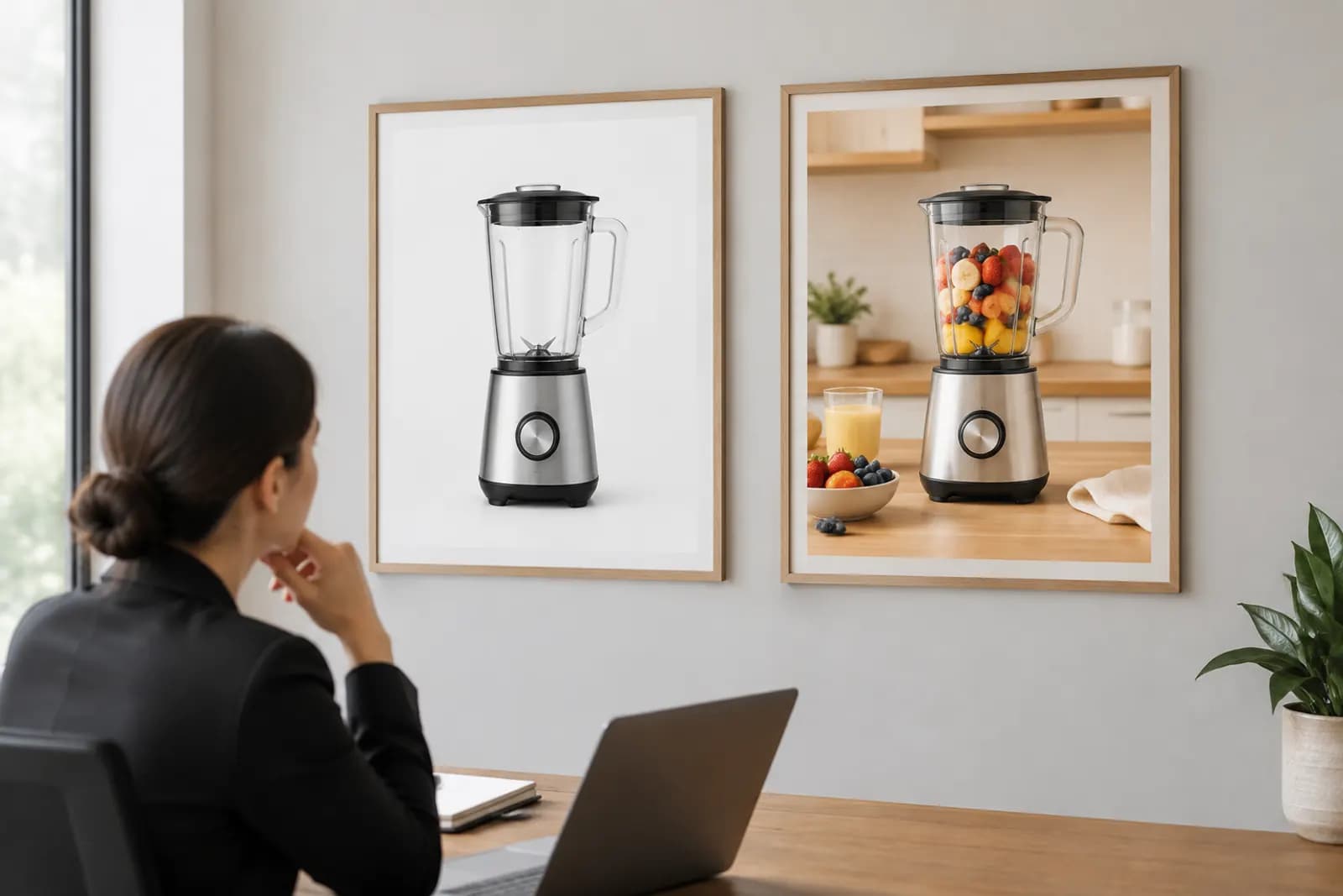
Custom images: put the product in a life
The custom image is there to add context next to a row of white-background products. The difference from a detail-page lifestyle shot is display size. In an ad, the image might render a few hundred pixels wide, and every fine detail disappears.
So the rules for this shot:
- Big subject, simple background. The product should take at least a third of the frame.
- No text in the image. Overlaid text is a frequent rejection reason. Let the headline do the talking.
- Leave a safe margin. Placements crop to different ratios; keep the subject central.
- Only your products. Nothing in the frame should carry a recognisable third-party brand.
One easily missed detail: the product in the custom image should be the product you're advertising. A scene featuring product A on an ad promoting product B creates a disconnect after the click.
Video: design for silence
Sponsored Brands video usually autoplays muted in search results. Your video has to work with no sound at all. A lot of videos repurposed from social platforms rely on voiceover and music for pacing, and they fall flat here.
The structure we script against:
| Time | On screen | Purpose |
|---|---|---|
| 0–2s | The product, ideally already in use | Say what it is |
| 2–8s | The single most important action | Prove the main benefit |
| 8–20s | Two or three supporting moments or details | Answer common doubts |
| Final 3s | The full product | Leave a clear picture |
Things that get videos rejected or make them underperform:
- Black frames, fades or a long logo animation at the start;
- Prices, discounts or "limited time" language;
- URLs, QR codes or anything pointing off Amazon;
- Blurry footage or the wrong aspect ratio (a vertical video letterboxed into a landscape frame);
- A product in the video that doesn't match the advertised product.
On-screen text
With sound off, on-screen text carries your extra information — but keep it lean: one short line per shot at most, large enough to read on a phone, placed centrally or in the lower third, away from corners where player controls may sit.
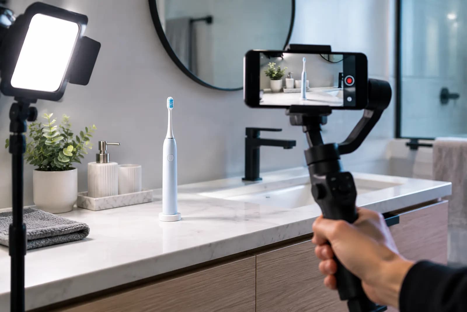
Example: an electric toothbrush
One toothbrush brand's original ad was a 30-second brand film: a wide bathroom shot, a smiling model, slow-motion water. The product first appeared clearly at second eight. The rebuilt version:
- 0s: the brush on the sink, a hand picks it up, the display lights;
- 2s: brush head close-up, vibration visible;
- 6s: into the travel case, case snaps shut;
- 10s: charging base with battery life shown (using real figures);
- 15s: colour range side by side, end.
Fifteen seconds, every point made visually, nothing dependent on sound. Whether it performs better is a question for the campaign data, but it now meets the basic test of reading at a glance.
Testing creative
You can run ads with different creative inside the same campaign. Change one variable at a time — only the video, or only the custom image — and keep keywords and budget constant. Wait for enough impressions and clicks before drawing conclusions; small samples swing wildly.
If you need several scene variants for testing, AI generation can produce different settings from one product photo, output at 1200 × 628. When a square scene needs to become landscape, AI outpaint keeps more of the subject than cropping. Before anything goes live, run it against the rejection list above, especially text and third-party objects. Keep the style consistent with your detail page and your Brand Store, so the click doesn't feel like landing in a different shop.
Upload one product photo and get a full set of listing-ready visuals in minutes.
Keep reading
Amazon main and additional image requirements: white background, fill ratio and size
Read article