Designing an Amazon Brand Store: page structure, hero sizes and the mobile check
A Brand Store isn't a second product page. It's a catalogue people should be able to browse. Here's how we structure pages, order homepage modules, size the hero and avoid mobile cropping problems.
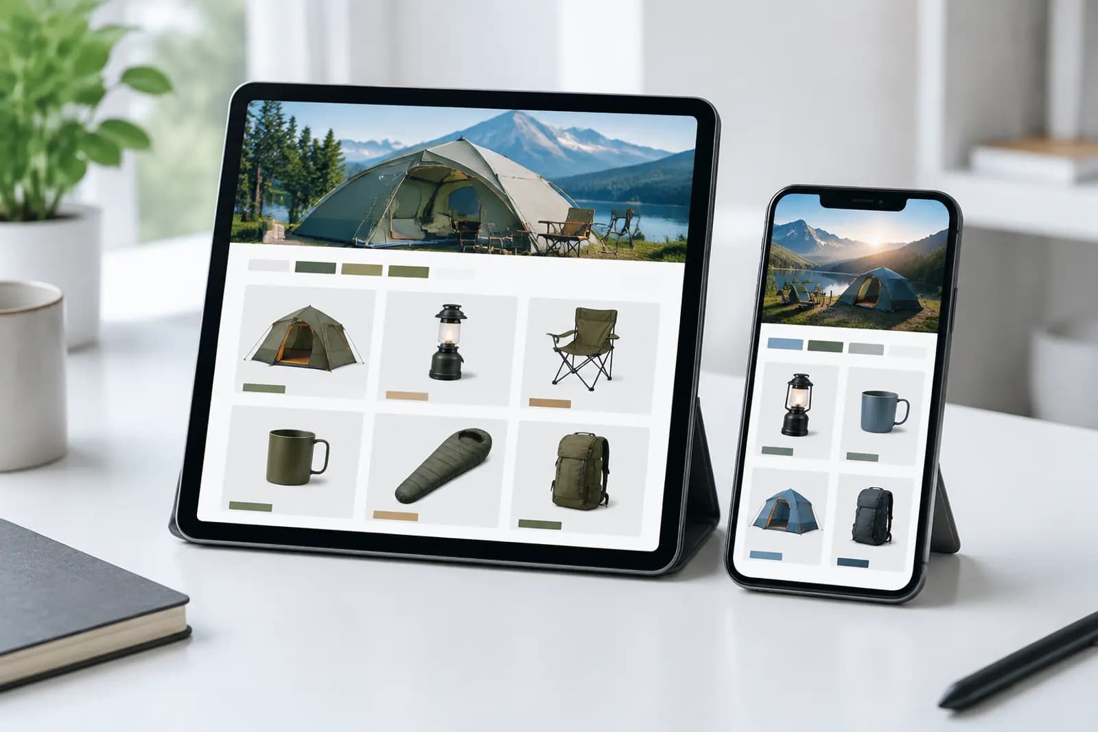
Amazon Stores is free once you're in Brand Registry, yet most stores we see are a single page: one hero image and every product tiled underneath. That's just a search results page with a banner. Visitors look once and leave.
A Store that works is closer to how a physical shop is laid out: a themed display at the entrance, departments further in, bundles and accessories near the till.
Start with the page hierarchy
Stores supports multiple levels of pages. Most brands need two:
| Level | Content | Example (outdoor gear brand) |
|---|---|---|
| Home | Positioning, current focus, category entry points | Camping season feature, four category tiles |
| Category pages | Products grouped by category or use | Tents, lighting, cookware, storage |
| Feature pages (optional) | New arrivals, gifts, bundles | Beginner camping kits, holiday gifts |
Name pages with the words shoppers search, not internal collection names. "Lighting" is easier to find than "Lumen Series".
Homepage module order
The homepage has three questions to answer: who is this brand, what are they pushing right now, and where should I go next? The order we use:
- Hero — brand mood, no paragraphs of text;
- One feature block — the seasonal hero product or new launch, as a large image plus product tiles;
- Category entry points — one image per category, linking to its page;
- Best-seller grid — a shortcut for people ready to buy;
- Reasons to trust — one or two images on materials, testing or service, consistent with your Brand Story;
- Video (optional) — a product demo usually beats a brand film.
Hero and logo specs
- Hero image: minimum 3000 × 600 pixels, a 5:1 panorama;
- Brand logo: minimum 400 × 400 pixels;
- Image tiles: sizes vary by tile, and the builder shows them at upload — use those.
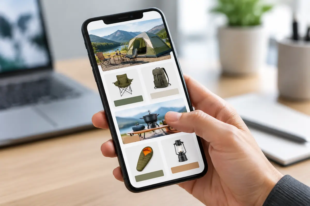
The ultra-wide hero is where mobile problems start. Phones are narrow, so the hero gets cropped or shrunk depending on the device, and anything near the edges tends to disappear. What we do:
- Keep the subject in the central third of the frame;
- Avoid text in the hero; if you must, make it large and central;
- Check the builder's mobile preview, then check again on a real phone.
Mobile traps
Mobile carries most of the traffic in many categories, but the builder opens in desktop view, so issues hide:
- Tiles reflow. Two images side by side on desktop stack vertically on mobile, which breaks designs that relied on them facing each other.
- Small text vanishes. Captions inside images that read fine on a monitor become illegible.
- Product grids get long. Four across on desktop becomes two across on mobile. Keep the homepage grid to 8–12 products and put the rest on category pages.
Category pages: group the way buyers think
How you group products matters more than how the page looks. Common approaches:
- By category — tents, lighting, cookware — for brands with clear categories;
- By use — weekend camping, hiking, car camping — when products cross scenarios;
- By customer or budget — beginner kits, upgrade gear — when the price range is wide.
Put a category lifestyle image at the top of each page and the product grid underneath. For large categories, add a banner mid-page addressing the most common question in that category, such as how to choose tent size.
Judge a redesign with data
Store Insights shows visits, page views, sales and traffic sources. Compare at least two to four weeks before and after a redesign:
- Did page views per visit go up? That means navigation and entry points are working.
- Did sales from ad traffic landing in the Store improve?
- Which pages get almost no visits? Merge or remove them.
Avoid comparing across a major sale; event traffic moves every number at once and hides the effect of the redesign.
Preparing the assets
A two-level store with five categories needs at least one hero, five category images, a set of lifestyle scenes and a few banners. Consistency is the hard part. Pick one "reference scene" for colour and lighting and make everything else match it.
If photography is limited, you can draft scenes from your product photos in AI generation, then use AI outpaint to extend a square image to the hero's panoramic ratio with the product kept central. Zoom in on the extended edges before using them — warped objects and visible seams show up there first.
Upload one product photo and get a full set of listing-ready visuals in minutes.